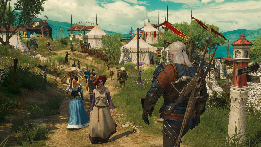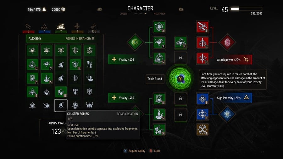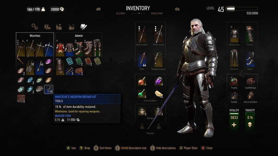
CD Projekt Red's at it again, going above and beyond the call of duty when it comes to providing its games with post release support. Alongside The Witcher 3: Blood and Wine, which launches later this month, the developer will be releasing an update that completely revamps The Witcher 3: Wild Hunt's user interface and menu systems.
Generally speaking, these redesigns look a heck of a lot smoother than what the title currently has, and screens like Geralt's inventory seem far better ordered and easier to navigate. What's more, the grizzled witcher can now be rotated so that you can see his equipment in all of its glory, and you'll be able to read books, notes, and other scribblings upon finding them, without actually having to dive into the menus. Sounds good to us.
Take a look at the revamped interfaces and let us know if you'll miss fumbling around your collection of dusty tomes in the comments section below.


[source rpgsite.net, via neogaf.com]


Comments 10
Nice. This has been my first CD Project Red game but they quickly won me over. I'm very interested in anything they do moving forward.
I kind of liked the old school RPG menus they had a charm to them. Granted they weren't very user friendly but those new screen shots look like a mobile app.
When is this update coming?
The only thing I dislike about the current menu system is the lag that comes with it. Being such a huge RPG, it's a game that requires constant interaction with the map, inventory, etc so dealing with the lag becomes a bit of a nuisance, albeit one that is admittedly a small issue in the grand scheme of things. I wonder if this redesign goes some way to relieving any of that lag. I hope so.
@wittypixel Presumably either just before or on the same day as Blood and Wine.
Thank god. Did my head in that.
im pretty sure you could already do that with books, mebe just the pc version?
@ShogunRok Thanks.
I have to learn how to play again..probably play this before uncharted.
Hopefully they speed up the menus. The layout is a bit fiddly but the main issue has always been the second or two wait every time you want to open the menu. Also if they could make it so the area you have to be standing to loot something is bigger would be great, that's awfully fiddly sometimes.
@johnny30 Nope, never been possible in any version. Unless it's a mod or something?
Show Comments
Leave A Comment
Hold on there, you need to login to post a comment...