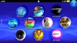
The platform holder's ditching the award-winning navigation system for something more touch control suitable. The NGP's hub menu system is certainly colourful, but we can't help but feel it all looks a little bit messy. Like any smartphone really.
Perhaps the bigger issue is how child-like it all looks. It's the kind of interface you'd expect to see on a kid's Vtech edutainment toy. It doesn't scream "sophisticated hardware" like the rest of the NGP.
The good news is that the NGP is still some way off, and this interface is very unlikely to be final.


Comments 0
Wow, no comments yet... why not be the first?
Leave A Comment
Hold on there, you need to login to post a comment...