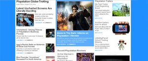
Last Thursday we said to ourselves, "You know what PushSquare, you're the best Playstation site on the 'Net, but you could be better." So we brainstormed. Then we brainstormed some more. We come up with all the things we liked about the site, and all the things we didn't like.
Our biggest concern was with the homepage. We felt like returning visitors were getting all the content they needed on a daily basis (because the blog format allows you to simply scroll down and see all the latest bits and bobs) but the content wasn't focused enough for occasional visitors. Reviews got buried. Previews got buried. All in all, there's wasn't enough there for new visitors to get engaged into.
So we've worked on making the site accessible to both parties. Note the picture. That's PushSquare's new homepage. He says "Hi".
We admit over the past few days to neglecting you guys just a teensy bit (hey we've still posted lots of great Playstation stuff). But y'know what. We're nearly done working on this new layout. And then we're going to be bigger and better than ever before.
There are still kinks to iron out but we're aiming for a Monday launch. Note, this will be an ongoing project. Despite a "launch"; we still thoroughly intend to work with a regular visitors to get the layout more in-tune with what you think it needs.
We're super excited about this new layout. Hopefully we don't lose the whole CSS stylesheet. Like we did this morning. Tears were shed. But we're getting there!


Comments 0
Wow, no comments yet... why not be the first?
Leave A Comment
Hold on there, you need to login to post a comment...