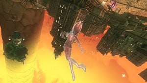
Gravity Rush’s art is heavily inspired by the popular Franco-Belgian comic book style known as bande dessinee. Art director Yoshiaki Yamaguchi explained that the style is all about exaggerating notable visual elements, such as Gravity Rush’s overstated verticality.
Writing on the PlayStation Blog, he continued:
The direction we chose to use for the game’s graphics conveys the necessary information with exaggeration that matches the player’s sensation. Taking that into consideration, we also wanted to use line drawings, the characteristic of bande dessinee and the simulation of beautiful air effects. I think the broader the game art expression becomes, the more interactive a game becomes.
Yamaguchi added that idea of a “living background” was pivotal to ensuring players feel an attachment to the world. He concluded:
Environmental background is not a piece of a picture, but it actually exists within the game, and we can use that background with our gameplay. By combining the unique art style of bande dessinee and the idea of living background, we created a sensation that could only be brought to life with a video game.
You can see how the platformer was originally pitched in the 2008 concept video embedded below. Gravity Rush itself launches next month exclusively on Vita.
[source blog.eu.playstation.com]


Comments 4
Sorry to be a pedant. Technically there is an accent above the second last "e". Should be "bande dessinée". It completely changes the pronunciation.
@Ginkgo: You might want to let the nice people over at the EU Playstation Blog know that, then, so that they can correct the source article :3
@theblackdragon - Comment posted on EU blog.
@Ginkgo .-. Wouldn't the accent be implied?
Leave A Comment
Hold on there, you need to login to post a comment...