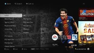
If you were getting tired of the PlayStation 3’s clunky old store-front, then we’ve got good news for you – the entire portal is getting a makeover from 17th October in Europe and 23rd October in North America. The overhauled look – announced at a London press event earlier today – will bring with it a host of new features and functionality.
First and foremost, though, content will look better than ever before. Massive interface changes will ensure that games are better promoted, and fancy new technology will allow the screen to scale to different television sizes and resolutions.
The design is built around the popular “Hero” concept, which will push popular titles like Assassin’s Creed III and FIFA 13 to the very front of the page. Content will then rotate using a carousel set-up, which will allow more titles to be highlighted on the homepage.
Functionality will also be improved. The clunky search system of old will be replaced by a new smart system which will predict what you’re looking for as you type keywords. Abbreviations and misspellings will also be covered. Sony promises that the search functionality will get even better over time.
In addition to the search improvements, content filtering options will be enhanced as well. You’ll now be able to arrange content by price, genre and even peripheral support. So, if you’re looking for PlayStation Move first-person shooters under £9.99 – you’ll be able to do that.
Finally, content for popular titles will now be grouped, allowing you to access all of the DLC, demos and videos for a single franchise or game in one place. The movie section of the PlayStation Store will follow a similar format.
We’ve embedded a few screenshots below. Let us know what you think in the comments section.
[source vg247.com, via thesixthaxis.com, computerandvideogames.com]


Comments 19
Thank God. Navigation on the Playstation Store is horrible as it is. I'm glad that this revamped version solves issues that shouldn't be there to begin with, such as the horrid search system and the inability to sort content by price. The latter is particularly useful when you have "loose change" that you can spend on a good Mini, for instance.
It's a direct copy of Microsoft's Metro interface, but if it improves usability, then it can only be considered a good thing. I can't help but feel it's a bit dark, though.
Brilliant news!
Ah, very good news. The store has felt clunky and over complicated for a long time now.
Now this is unacceptable. I own a 360 and don't even like microsoft interface. Couldn't sony come up with something different? Also NB4 sony copies yet again.
I must be the only one who doesn't mind the current store's interface. I do wonder if this will change the Vita's store front since they are somewhat similar.
@Metroid133 They've said they're not at the moment.
@Metroid133 - I have never had a problem with it.
@Metroid133 I have never had a problem with the current store's interface either.
So does this mean we'll be able to alphabetize our DL history now?
I'm surprised they moved PS+ so far down the list and didn't put it on top or second.
Looking nice is good, lets see how functional it is. Currently the PS+ section is somewhat of a mess with all the different boxes within boxes for Games, New Releases, Expiring Soon, Free Games, Discounts, etc. Looking forward to it.
The new functionality sounds good but I don't like the new design.The stupid "Hero" thing takes up half the page!
I actually like the current interface but whatever if it runs better and it's easier to navigate a change isn't a bad thing.
I'm hoping for improved functionality, speed and grouping of content. After replacing my PS3 and needing to re-download a fair amount of content from 2007 onwards (updates/dlc etc)- I invite any of you to trawl through your downloads list looking for specific content. It was tiresome in the extreme- and searching the store for a lot of it didn't help as it wasn't listed as available on the storefront anymore but still downloadable.
@Metroid133 I have no problem wiht the current store interface either. But i guess ill get used to the new one. What i find a bit aggrevating are the people who have begun to complain ( mostly on other sites ) that this ia a blatant copy of XBL's interface. True, its pretty much is, but that's what gamers have be asking for for years now and when they finally get it they still complain. This baffles me.
Sorting by price? FINALLY.
looks really good
Looks pretty slick.
There are some even better screenshots on the North American PlayStation Blog:
http://blog.us.playstation.com/?p=87265
The search feature is a welcome change, as it currently sux.
In terms of layout though, once you know your way around, the current store isn't THAT bad. But there's loads of space for improvement, so I'm happy they've redesigned it.
Show Comments
Leave A Comment
Hold on there, you need to login to post a comment...