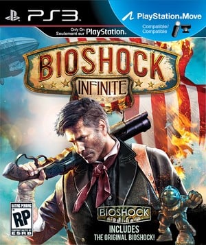
There’s been a lot of talk about bad box art over the past couple of weeks, which makes the arrival of BioShock Infinite’s final cover timely to say the least. The wrapper – which leads prominently with protagonist Booker DeWitt – shows the lead character pouting with a shotgun nestled on his shoulder. There’s also a blimp in the background, and a burning American flag.
While there’s nothing inherently wrong with the image, it sure looks plain for a franchise that's recognised for its strong art direction. Compare it to the covers of the previous two BioShock games, and we’re not sure it’s got the same pizzazz.
Still, the image reconfirms that the PlayStation 3 version of the adventure will bundle both PlayStation Move support and a complimentary copy of the first title in the series. We suppose that’s something to be thankful for at least.


Comments 11
Looks fine to me, but I've always hated the Playstation move compatible logo :/
I like it too... Bit old-school!! Hate the move logo too..
Look very boring. A dude with a gun..where have we not seen that before?
Seems kinda random to include bioshock 1...
It's ok I seen worse, and I LIKE the move logo (for no reason at all oO)
Hey look at the bright side, without games that have bland covers, we don't truly appreciate the games with amazing covers!
It's not too awful, and including Bio 1 is what guaranteed my preorder anyway
Ah, come on everybody. Look at it closely!!!! A man .... a man who must defend himself against the unknown. He holds a gun for protection while he looks into the the eyes of the player which says "You control what I do" Then behind him a burning image of the flag on fire which says to us that "This is not a ordinary game with a happy ending." Then above everyone you see a half of a zeppelin - not much there - but still. In a personal note to this, I have never seen such backlash over a cover. What happened here to us. We are gamers not critics of covers. Who cares what the cover looks like. We are not going to be staring off at the cover for 10 to 15 hours - I don't know how long the game really is. So stop the hate. Just love the fact the game is coming out soon.
He's a pretty good looking guy - I have no qualms
I see nothing wrong with this cover. The color palette they used is actually quite pleasing. And to be completely honest, it kind of reminds me of an old school carnival that you don't see too many of these days.
The only thing I don't really care for is the the small advert about the inclusion of the free original game that comes with it. It's the only thing out of place.
Who cares what covers look like, your not looking at it while you're playing, don't judge a book by its cover, ever heard of that
Show Comments
Leave A Comment
Hold on there, you need to login to post a comment...