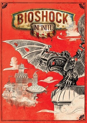
Regular readers will recall the brouhaha surrounding BioShock Infinite’s atrocious box art. After admitting that the cover was chosen as bait for frat boys, Irrational Games' gaffer Ken Levine also revealed that the developer would be producing an alternative image for players with more refined tastes. And here it is.
The art was voted for by fans of the game, with the embedded entry securing 38 per cent of the ticks. It will be printed on the reverse side of the less popular cover, allowing you to easily switch the design if you prefer. Other options will be available for you to download and print.
What do you think of the alternative box art? Let us know in the comments section below.
[source irrationalgames.com]


Comments 5
Much better. I like this trend; Borderlands 2 had a good alternate image on the reverse of the cover too, although I don't think it was intended as an alternate cover. I swapped it over anyway.
Honestly, this looks horrible - good grief !!!
It's pretty decent. The hipster in me always reverses covers when I can. XD
I like it! Definitely much better than the first option.
That's actual art I would hang on my wall.
Show Comments
Leave A Comment
Hold on there, you need to login to post a comment...