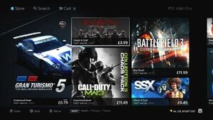
You’ll be able to reinvest your hard earned cash into the PlayStation Store a little bit quicker from now on, as Sony has released a patch for the overhauled online plaza that makes browsing through its menus somewhat swifter. Sadly, the update doesn’t fix the outrageous start up time, leaving you with plenty of opportunity to prepare tea and biscuits before you begin your virtual shop.
The patch weighs in at 26MB, which takes all of 45 seconds to download and install. But while the storefront is undoubtedly quicker, we’re still not sure about the overall makeover. Content is definitely better arranged these days, but it still feels like there’s a step too many in places. Furthermore, we wished that there was an easier way to see all of the latest releases.
What are your thoughts on the new PlayStation Store? Let us know in the comments section below.


Comments 9
you have to admit, it LOOKS better with all those floaty big icons of different sizes all over the place. Maybe they hired an art major to design it, rather than somebody who actually uses it to shop. Or at least tries to. I still hate having to "pay" for demos and free themes and avatars.
@rjejr Oh yeah, it definitely looks a lot better I agree. In fact, I think the whole browsing experience is far superior if you're just dropping by to buy something new. The problem is, as a regular user, I just want to see all of the latest stuff, and it's a lot harder to do that these days.
Yeah that's the one thing that drives me nuts with the new store: finding the latest stuff. At least with the last store it brought us to a page that had all the new releases for the week just slapped up there - here it's normally easier to use the search function for each little thing. Even then, it's normally a good idea to see what's releasing on the official blog beforehand.
But I agree that it looks nicer at least.
The look is a nicer but as mentioned its hards to find new releases and there are too many steps to download. And its so much slower. I wasnt bothered by the old look and if we gave up speed of navigation, easier access to the latest update, and start up time just for a pretty face I think we got the short end.
It's still way too hard to navigate. I miss the old searching menu, which was easy to navigate AND slightly customizable.
I don't care how much "better" it looks - it's cluttered, unintuitive and well, frustrating. I actually don't even check the store any more for weekly updates, instead I check the updates on my PC and if there is something I want, I go directly into it to download it.
It might look like a Lamborghini, but it sure as heck doesn't run like one.
In fact, I recently went into the store to make a few purchases. After all the fuss of trying to get my games into my cart, the 2-3 minute wait to get into my cart and another 2-3 minutes of waiting to purchase the games... it froze. Do you think I spent the time to go back in and try again? **** no!
All shiny... but ugly on the inside.
I've only bought one or two games since they launched it.
How bout they make a new store or an improved version of the old one cause this store is a piece of crud that I have just quit cause its so bad, its less effcient and it takes longer to do things than the old store did not because it takes longer to load but information on things and the things themselves are more buried and harder to find on the new store.
My only beef is that occasionally there'll be something free for plus subscribers but it doesn't show up on the "free games" tab. I've almost missed out a few times. I have good interweb contraptions, but it's still unacceptably sticky and slow. Why'd they even change it to this style?
Show Comments
Leave A Comment
Hold on there, you need to login to post a comment...