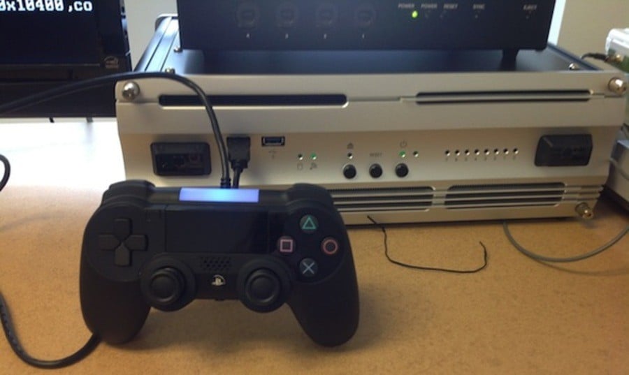
Destructoid has got its hands on what appears to be a photograph of a prototype controller for the PlayStation 4. The image matches up almost perfectly with recent rumours, showing a peripheral similar in shape to the DualShock 3 with a touchpad in place of the ‘Start’ and ‘Select’ buttons. It’s hard to get a good look at the triggers on the top, but they certainly seem to be changed, too.
Looking at the image, there appears to be a speaker below the touchpad in the centre of the device. There's also a protrusion beneath the 'PlayStation' button, which could be a headphone jack. There's no sign of the unit's infamous 'Share' button, but we suppose that it could be around the back or on one of the handles, assuming that it exists at all. The light on the top is arguably the most curious addition – could it be used for motion tracking similar to the PlayStation Move?
Subscribe to Push Square on YouTube167k
Regardless, if real, this is clearly a working mock-up. The analogue sticks look cheap and poorly moulded, while the d-pad – which is similar in style to the PlayStation Vita – looks like it’s been cut out of cardboard. Still, the shape and features corroborate with everything that we’ve already heard. Sony has apparently been toying with multiple controller designs, so this could just be one of them.
Oh, and as for that big grey box in the background – yeah, that’s probably a development kit. The wait until 20th February goes on.
Update: According to IGN's Colin Moriarty, the controller is real. "A trusted source has indicated to me that the PS4 controller [...] is 100 per cent real, but also a prototype," he Tweeted.
[source destructoid.com]


Comments 25
See, now that I could live with. Maybe even learn to love.
@ShogunRok Yeah, if this is real, I'm ok with this. It's basically a DualShock with a touchpad in the middle. That's fine. It will obviously look better in its final form. (If real, of course.)
@Savino The analogue sticks are the worst part as far as I'm concerned. I can't imagine they'll be final.
@get2sammyb Yeah I mean I've always thought 'if it's not broke, why try to fix it?' Nothing wrong with the DualShock design - and I'd be perfectly happy with something like this.
Probably a dev kit version of the controller, but I think the final version will look fine.
The d-pad looks similar to the Vita one. This a very good thing!
Dreamcast 2.1?
(Wii U is Dreamcast 2.0)
Looks...like a modded PS3 comtroller to me. :/
its cool but looks awful. i think my eyes are bleeding from the sheer ugly.
@odd69 It's a prototype, though. The final unit won't look like that.
I'm surprised more people aren't discussing the Move-esque light. We hadn't heard anything about that. It lends credence to the report that every console will come with a new PS Eye, though, right?
I'm guessing that's also a speaker near the center.
The select button seems to be near the d-pad, I'm going to assume that the start button will be in the opposite side?
Change the analogs back to normal, make the speaker less conspicuous, make the controller a little more streamlined and I think it would look perfect.
That's a crazy idea for tracking. It makes sense, especially if the controllers have (upgraded?) sixaxis in em. Think it'll change colors like move does? I'd be down for it to be able to mimic the dominant color on your tv. Ambient lighting with headphones on would be immersive-feeling
If it does look like that I am dissapoint. Then again, i guess it's only a prototype.
it looks good to me, it's a prototype so it could have changes. personally I don't like the new joysticks, but the d-pad is nice
Looks good, but needs some general refining and those analog sticks are blasphamy. The light on top looks like it could do pretty neat stuff but it needs to stay off when it's not in use
Likes like a £10 third party controller, nasty. But, as has been pointed out- could be fake or an early mock up. Here's hoping.
Hey, that looks like a prototype that's not meant to be consumer end design! A speaker is a fun addition. I like that underused speaker on the Wii Remote.
i like it . it might be the photo , but it looks like it has a sort of rubberised surface thing going on .
Seriously, this thing is fugly, look at your DualShocks, PSPs and Vitas- beautiful things- this just can't be the final version...
@Savino hahahahaha
For anybody left in the world who still hasn't used a Wii - that light on top could make the XMB navigation SO much better. I HATE HATE HATE using the Move on the XMB. The Wii and it's "sensor bar" that is simply 2 red LED lights works so well out of the box. And since Move sucks anyway but "Shooting" games seem to work Sony may have finally merged the Wiimote ad DS in a way that's actually useful.
@rjejr I have to disagree about the Move sucking. It's easily the most accurate, and therefore the most immersive, motion controller on the market. Of course shoting games work with Move, the Move itself is as I said, the most immersive motion controller on the market. So, shooters feel a lot more realistic than they would if you were using a DualShock. Also, the move works well out of the box too, I don't know why you're having so much trouble with your Move, but mine works excellently.
@get2sammyb i agree with you, i loathe them looks like 3rd party trash analog sticks to me
Show Comments
Leave A Comment
Hold on there, you need to login to post a comment...