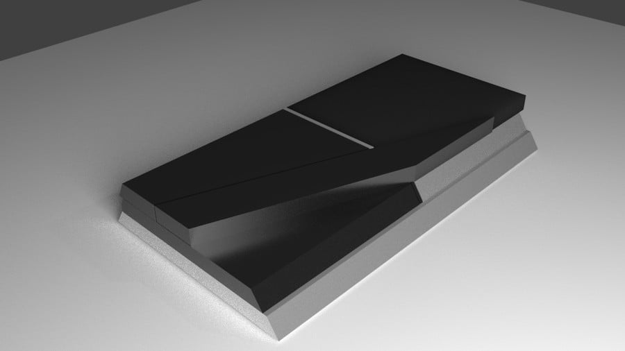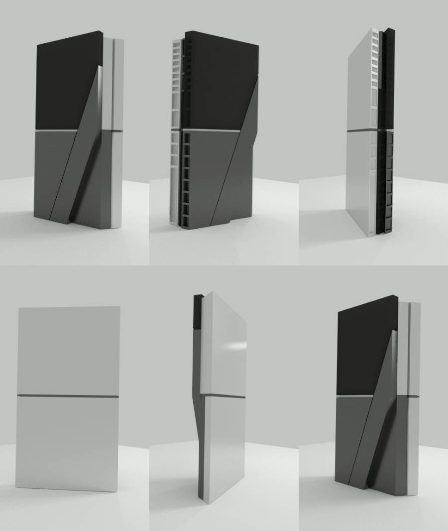

Ever since Sony released its sly PlayStation 4 teaser trailer, artists around the globe have been eager to produce some mock ups of the system’s final shape. We’ve already seen some nifty diagrams, but this latest attempt by Reddit user MrSmooth goes above the call of duty – offering a full three-dimensional render of the hypothetical machine.
The design appears to have all of the components of the recent trailer – there’s the strange diagonal lip, and the grills at the back. It is, however, missing that weird circular surface that was so pronounced in the video. Sony’s promised to give us our first glimpse at the console during E3, a move that’s at least keeping us guessing until the big show.
Subscribe to Push Square on YouTube167k
You can peruse all of the concept images through here. Do you like the general idea, or are you horrified by the proposal? As always, let us know your thoughts in the comments section below.
[source reddit.com, via ps4daily.com]


Comments 18
It's stylish no doubt, but it's sooooo angular. Maybe looks a bit too much like monolithic abstract art for something as practical as a console. But again, it is stylish and has clearly had a lot of effort put into it.
I don't care how you look just play my games.
I'm not particularly fond of this design, though I give props to the artist for the full 3D render.
I doubt this is what it will look like, but I reckon that he's got the right idea with the blue strip:
@get2sammyb Yeah, most likely. I really like the blue strip, and I find it ironic that it mimics a certain Tron-Box we saw a few weeks ago...
If the light flashed on and off like that while playing I would find that distracting.
Daaaaaayyyyyuuuuuummmm! They should call that SexBox...........cause it is hooooooot.
I think that design is ugly, I actually prefer the other artist rendition that you guys posted.
I have to agree with it probably incorporating something like the blue LED strip. It would make a lot of sense since the teaser had that blue pulsing light at the end of it. At this rate, it could define the console's appearance.
Just take my money and shut up.
Bring back the PS3 fat design.
where are those cool vents? Where's that stupid circle bit? It looks nice, but I think it's missing a lot from the Sony sneak peak?
Looks pretty sexy. I'd take it out for a nice candle-lit dinner, and get it home before 11.
@TheRealBatman lmao such a gentleman
They copied the Wii's flashing blue notification light? Wonderful.
If it does look anything that abstract, well that's up to them, I just hope the designers take into account heat dissipation so the thing doesn't die. I owned a purple Gamecube so I'll own anything regardless of appearance. .
At a quick glance this kinda resembles the PS2 design..
Where the circular thingy?
It's an interesting design, but I'm not fond of it.
Show Comments
Leave A Comment
Hold on there, you need to login to post a comment...