No matter how much you want it to be authentic, we’re afraid to say that this incredible PlayStation 4 trailer is as false as your grandparents’ teeth. A representative for Sony Computer Entertainment America has confirmed to Kotaku that the footage was not produced nor released by the company, meaning that it’s little more than an elaborate hoax.
Of course, the signs are already there if you look hard enough – it’s using existing footage of inFAMOUS: Second Son, and ironically there’s no ‘Make.Believe’ blip at the very end of the video. Still, this comes agonisingly close to being plausible, and we actually quite like the direction of the footage.

Despite being a fake, though, it raises an interesting discussion: what will the PS4 look like? Up until now, it’s a topic that we haven’t really given a whole lot of thought, but we’re curious what direction you think that the company’s going to adopt with the box’s design. Let us know in the comments section below.
[source youtube.com, via kotaku.com]


Comments 18
You mean someone could do better marketing than sony? LOL Worst part is that sony's advertising is so bad
@Sanquine Haha, yeah, that's probably the telltale sign — this is better than a trailer Sony would produce!
Not that great... they got the symbols in the wrong order at 11 seconds.
Triangle, Circle, Cross, Square... it's only been a trademark for 19 years or so.
@Paranoimia I missed that, good catch!
I didn't like it personally - rapid cuts and bass music give me agita - but I still appreciate that it was well made and probably better than anything Sony is going to come out with. I can't imagine people would really want a glowing neon bar around their home console, but the sleek black curves looked good.
As for what the PS4 will really look like, I'd like a flat top w/ built in induction charging so I can just put my controller down when I'm done playing and it will charge. Room for 2 controllers would be nice. That "phat' curved PS3 top has got to go, and that sliding slim-er PS3 top is horrible also.
@rjejr Yeah agreed, the sliding top is pretty tacky. I quite like this:
@get2sammyb That we know that sony is going to produce something worse is a bad sign. Microsoft knows how to market their xbox. Even if the playstation 4 is much better with a more focus on the gamer it will not sell in North America. chauvinism perhaps? http://en.wikipedia.org/wiki/Chauvinism
For example : I know that i love killzone so much because it is also from a dutch developer! ( And one of the best shooters out there)
@Sanquine I've never liked any of the Xbox ads since the original in the UK (the baby shooting out of it's Mum, flying through the sky, aging until its an old man who crashes into a coffin). Said sod all about the Xbox but was a good advert. Since then its just "Here's an FPS! Here's another! And another! And..." zzzzzz. Then again, that's all the 'kids' want nowadays.
@rastamadeus Kids want shooters ? ( I want killzone mercenary xD) No, but when i was a young kid i just wanted mario! Ooowh the good days of mario on the gameboy on the backseat of the car<3 Then when i was 12 years old mario and the six golden coins... For me personally that where the best gaming years of my life.. Now its a hobby but not something like when i was a youngster ... Miss those days only kingdom hearts has the magic to do the same
@Sanquine SML2 was a great game. Loved Bunny Mario. But yeah, sadly, they just want COD and Battlefield nowadays. It's quite distressing really. How many wonderful, unique and magical games get ignored completely for another bland shooting game?
@rastamadeus I know why... Look at the kids from today and tomorrow.. I am 23 years old and worked my bootie off for a master degree ( In economics) . Now i see kids not doing there atmost best to get a degree... I see kids failing because they got no values. Furthermore, they only care about booze and other things. Same goes for games.. Aggresive little trolls
The Micheal, GoW: Ascension, Kevin Butler and many other commercials were way better than this. I'm not saying it was bad, it just wasn't great.
It's going to look like a black box.
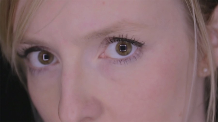
I want symbols like that in my eyes! So cool
Something like that would be a successful commercial
@get2sammyb
That PS4 design you show there really looks like the original Sega Master System (North America)! Kinda like the sleek NES prototype designs.
@Ginkgo Haha — what if it's not black, though?! (It will be.)
@get2sammyb : Care for a little wager?!
Leave A Comment
Hold on there, you need to login to post a comment...