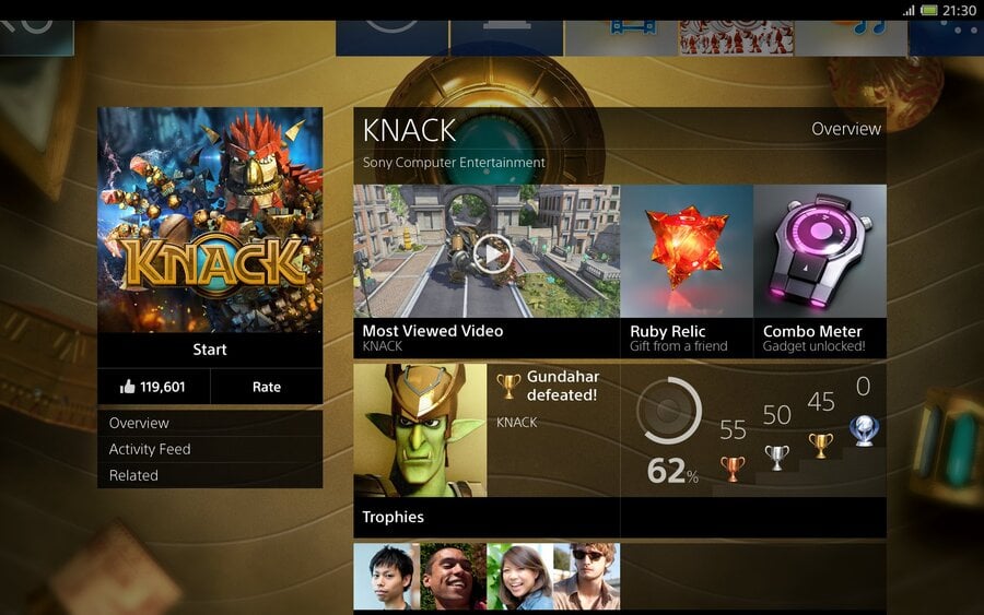
We’re in PlayStation 4 limbo at the present. The console is approximately three months away, yet we’re still greedily awaiting more information about its software, features, and functionality. With platform holder Sony running a tight ship until GamesCom, that means that we’re being forced to feed on scraps – like this short, unintentional glimpse at the console’s user interface.
During a livestream of free-to-play first-person shooter Blacklight: Retribution, a PS4 development kit crashed, giving us an early look at the system’s interface in action. One thing to note is that while the software itself locked up, the console didn't need to be reset – it simply recovered at the menu screen.
 Watch on YouTube
Subscribe to Push Square on YouTube166k
The interface looks the same as in mock-up images that we’ve already seen. There’s profile information at the top, and a selection of boxes in the centre. There are icons for video editing, downloads, and the web – finally confirming that a browser will be included with the console – in addition to a main game hub.
Judging by the footage, you’ll need to be connected to the Internet in order to peruse details pertaining to the current title. In official interface screenshots, software information comprises shared media, add-on packs, and more. It’s unclear whether all of your applications will adopt this tiled approach – that could get messy if you have a lot of games.
It all looks snappy and responsive, though – even at this early stage. We’re especially fond of the PlayStation Store-esque sound effects which accompany button presses. What do you think of the interface so far? What do you want to know more about? As always, let us know in the comments section below.
[source youtube.com, via neogaf.com]


Comments 12
Damn they took it down already
Edit:nvm
It's a dev kit so not sure how close it will be to retail machines watched the livestream last night seemed to be pretty snappy.
edit: Its looks like the xmb and windows 8 had a baby and this is the result lol
this link worked http://www.youtube.com/watch?v=INCLo7JuSww
@8vpiper This looks identical to the screenshots that they've released of the UI, so I think that this is how the retail version will look.
@get2sammyb yeah i see the icons are the same and same order and have too say im ok with it! i.e no advertising crap!!!!
btw 420.4GB out of the 500 available, so that means UI and Video Recording use about 80GB of the systems HDD......I'm guessing then its not full 1080p recording but 720p compressed, because 1080p RAW......is nearly 2GB per minute at 15.....hm maybe full 1080p guess it wouldn't be too bad. But even then there is nearly 50GB that the System uses....I'm guessing most of it reserved.
If the PS4 does happen to record 1080p RAW then it will be nasty clear compared to the xbox ones 5 minute 720p format.....which is so painfully compressed.
also system version tells me this is near launch UI because the version is in fact 1.0 and not 0.9 or under. So there already is a finalized version of the UI in place although stability will probably bring out the rest giving us 1.1 Full on launch night.
Also as soon as he hit play on the game....it instantly started recording....so even from the opening splash screen that auto 15 minutes starts there, which means you start streaming instantly on game opening. It's noticeable by the video tab popping up on the right side of the screen and showing red when they launch the application.
Also turn off PS4 actually says to use this option before unplugging the AC cord.......so they know people don't want there systems on 24/7 and even prepared for it......Sony has thought a lot of this through VASTLY.
While I'm sure this is pretty close, I'm positive this is not exactly the interface we will receive at launch. What Sony has teased so far has quite a bit more polish on it. It would also be a mistake, @ViciousDS, to pull spec information from this, as this is an early dev unit. As far as layout, however, this is probably rather close
It's very slick. I feel a bit sorry for the developers in the video, though!
@ViciousDS
I'm not worried about the hard drive being only 500gb but it baffles me why consoles now only have 500gb of HDD. 1TB should be standard. When i recieve my PS4, the first thing im going to do is replace the 500gb with the highest compatible HDD available before even playing or downloading any games. Knowing Sony's history the ability to replace your HDD shouldnt be a problem (I hope).
@Kayoss that's why i feel sad for xbox owners as they are limited to that 500GB HDD....also there is a reason its got 3 usb ports anyways because everyones going to be forced to plug in an external just to be able to keep up with the size of games.
also any laptop hdd should fit as normal....just like on the ps3's. What I want to know is the read and write speed.....because 5200rpm's is not going to be enough to record the last 15 minutes of gameplay AND use the HDD at the same time. So i wonder if any 5200 drives will be compatible with the system.....but either way its 7200 or no go for a standard HDD for me anyways.
@Kayoss U watched E3 its all up to u, if u want to changed the hardrive day one ur free to do that no prob! Sony maid PS4 with that in mind remember they were listening to there fans!!! =)As far as read speeds thats something else u have nothing to worry about aswell!
Loving the snappyness, very quick,liking the sounds, adding to that feeling of fresh and all new!!! cant wait till launch day!!!
Looks very much like the 360 at first glance. Hmmm.....
Show Comments
Leave A Comment
Hold on there, you need to login to post a comment...