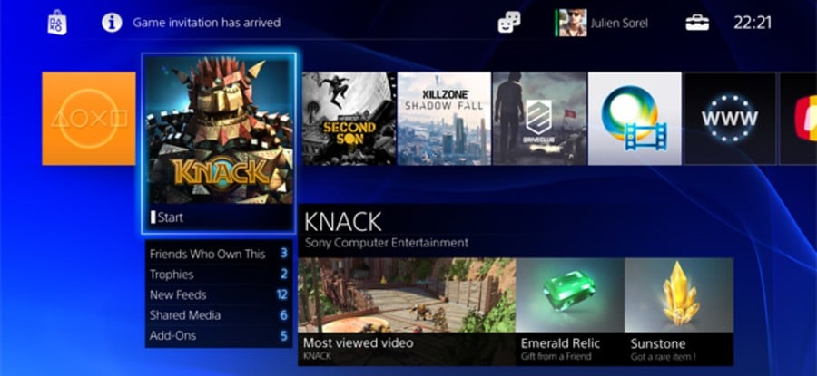
There was a time when a console’s interface consisted of little more than a digital clock and a save data protocol, but the PlayStation 3 era changed all of that. Microsoft can be perhaps credited for the improvement, as the Xbox 360 deployed with a cavalcade of features as part of its classic ‘Blades’ hub – but Sony’s former flagship format evolved over time, too, implementing streaming services such as Netflix and more detailed profiles after the device’s launch.
With consumers now expecting much more from their systems, the PlayStation 4’s user interface has been a frequent topic of discussion leading up to the platform’s release. Lead architect Mark Cerny and countless other Sony executives have cited a desire to make the next generation console feel more alive, and it’s managed to achieve that by incorporating PlayStation Vita-esque game profiles, video sharing functionality, and more. But do you like it?
 Watch on YouTube
Subscribe to Push Square on YouTube166k
There are lots of improvements over the relative simplicity of the PS3. The award-winning XMB may have offered an intuitive means to access your content, but it slipped behind the Xbox 360 in terms of functionality. Issues such as the lack of cross-game chat have been addressed with the company’s latest console, and the restrictions on multitasking have been removed, too. It’s now possible to seamlessly jump between games and other applications such as the PlayStation Store.
But while the PS4 commands a significant hardware advantage over the upcoming Xbox One, we suspect that the latter’s interface will become one of Microsoft’s trump cards. Features such as ‘Snap’ – which allows you to divide your screen between apps – have been hardcoded into the Redmond-based outfit’s system, while voice controls through the Kinect camera have again been prioritised.
That’s not to overlook the strides that the Japanese giant has made, though. The manufacturer’s new user interface – or Connected User Experience if you want the full name – is split into three different sections, which allow you to access different parts of the console at all times. The top portion includes links to key system components such as the PlayStation Store and your friends list, while the middle section is stacked with apps.
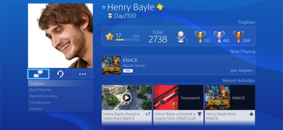
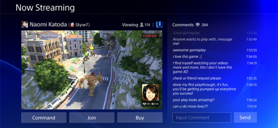
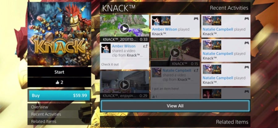
However, it’s the bottom area that’s arguably the biggest improvement, allowing you to browse a social feed pertaining to your friends – and join livestreams of anything that your pal’s are playing – as well as obtain detailed information on each game. You can peruse Trophy progress – which is now sorted by rarity – as well as view screenshots and key information for a particular release. It’s heavily inspired by the LiveArea system from the Vita, but it's a massive step-up.
These new features have prevented some old favourites from making a return, though. While Sony Worldwide Studios president Shuhei Yoshida has hinted that they’ll get added in later down the line, the next generation console is missing functionality such as MP3 playback, DLNA support, and theme customisation. It’s certain that these will get added later, but if you’re moving from the PS3, you may already be yearning for these simple features – and pondering how they even got overlooked.
But now you’ve had a couple of days to play around with it, what are your thoughts on the PS4’s user interface? Are you finding it as fast and fluid as promised? Do you feel like you’ve got a grasp on all of the features? What do you think of the layout? Are there any missing functions that you wish would get added in? Do you think that the platform holder should have incorporated the ‘Snap’ technology found in the Xbox One? Share your hype and gripes in the comments section below.
What are your overall thoughts on the PS4’s user interface? (36 votes)
- I love it – it’s fast, fluid, and gets me straight into my games
- It’s very basic, but I don’t have any major complaints
- I hate it – it’s clunky, overly simplistic, and poorly designed
Please login to vote in this poll.
What’s your favourite feature so far? (34 votes)
- I really like the ability to broadcast and watch streams
- I enjoy perusing all of the information for each game
- The swift multitasking feature is at the top of my list
- I’m really enjoying the cross-game chat functionality
- The voice controls and facial recognition are super cool
Please login to vote in this poll.
What do you most want to be added next? (33 votes)
- Please bring back MP3 support as soon as possible
- I’m missing the DLNA functionality at the moment
- I don’t like the blue, so customisation would be nice
- I’d just like it all to be stabilised, as it’s a bit clunky
Please login to vote in this poll.


Comments 16
It's a massive improvement over PS3's UI and that's the main thing I ask when moving onto a new console is that the hardware maker does whatever it can to improve certain aspects such as UI. It's not perfect, I still don't think it's quite as good as MS', but considering how far ahead MS once was in this department it's impressive that Sony is even as close as it is now. It's easy to navigate and I feel that the store is much better integrated into the PS4, it loads a lot quicker and that's huge for somebody like me who checks the PS Store nearly every day.
@Gamer83 Can you still manage the PS Vita like on the PS3? That's my main question at this stage - I haven't heard anything about that.
In truth, I haven't tried any of that stuff yet. I've had much less time with my new console than I wanted but have to pay the bills somehow and I also have to admit I got hooked on Injustice again, being able to take it to work for play during breaks is awesome.. Things calm down a bit tomorrow though so I plan on making a post sometime early next week (Monday or Tuesday) in the forums about my early experience with the system so I'll let you know about it then.
It's nice, but I'm not sure how much I everything's position being decided by when it was used last, I'm also worried that with a larger library of games that some games will get far into the back and get harder to find, espcially since they won't have a set location.
So far I like it but I feel that I am missing alot of the features. I will admit I am a little overwhelmed but the impatient part of me wants to play the games so honestly I haven't played around with the interface much.
The one thing I have to say that I dont like and I am not sure if it just shows up on my PS4 menu or what but on my Activity log it says my whole name rather then my user name.
For example it will say Real Name just downloaded Resogun. Real Name got a trophy for Resogun.
I dont like that so I went back into the menu and replaced my real name with my online name.
I don't own a PS4 yet, but from what I've seen of the UI's of both systems, the PS4's UI is the best. It looks fast, it's clean and the live area-esque section was a magnificent addition.
The Xbones UI looks pretty good too, the snap feature is really the only thing I like, though, it isn't as cool as some would lead you to believe.
@Tasuki you don't have to allow it to use your full name. You can have it remember you as your user name instead of as your real name.
I love the new interface, though it took me a while to find out how to delete uploaded videos. You have to go to system, then something like "software management" I think it's called. You can't delete from the upload video screen.
@ztpayne7: How do you do that I tried searching for a way to change it haven't found anything.
@get2sammyb: I haven't seen any real indication of Vita management support...the Store only has PS4 content on it ATM, that's for sure.
@ztpayne7: You can tell it to show your username by default online, but I haven't found a way to make it do so on your own system.
That bottom area for the social feed doesn't seem to be working at the moment...I've yet to see anything pop up there whatsoever.
I think that the UI separates the PS4 from all other gens. Some consoles are so focused on trying to sell you stuff that they bury games and videos in endless submenus or crowd them on the screen with lots of other garbage. I want to get to a game - just let me get to my game. And I think the two-tiered menu on the PS4 really accomodates for that.
I also think that the speed of execution is amazing. The long wait times to access my messages while playing games is gone. It seamlessly transitions out of games and into friend requests and other tasks.
I noticed you can't turn off a ds4 while watching netflix. PS button pauses it, then turn your controller off, but it's still paused grr. And controllers don't charge when it's actually off. The UI is confusing regarding what apps are running. There's enough ram, but still; no task manager thingy? I don't like having 100 video services I don't use, either. It's two steps forward, one step back, right now. I also don't use social media, so I can't have a normal picture, too. Ugh, my biggest gripe is that the apps are organized by recent use. Let me control where my stuff goes, crazy fools!
It's basic in its better than the Wii Us, but worse than the Xbox One which is what I was expecting in the first place.Only real complaint I have so far from what ive seen is the PSN is a goddman mess and the worse out of the three store fronts.
You'd think they design the whole think over for the touchpad or look similar to the what's new Tiles.
edit: I also would like to see the friends list become more like Twitter similar to what Miiverse and Live are doing this gen. I like that on the other systems I can follow a developer without impeding on my regular friends list.
I love the new system UI, it Murders the XMB tenfold! It's soooresponsive and feelsso much more alive... the on the PS3!!! You can get out of a game back to the main menu and back into the game faster than you do on a phone with quad core processor no exaggeration!!!!
@Sony_70 I don't know, I kinda like the Wii U one better, but maybe thats because theres no forced blue, and the clutter is mainly on the start screen lol.
sony need to restore its media streaming client,and mp3 playback facilitys as was present on the ps3,it looks like microsoft have implemented all the good features from ps3 and all the ps4 has gained is a proper game chat,I thought sony was more a console its looking like a money pit console.
Show Comments
Leave A Comment
Hold on there, you need to login to post a comment...