Box art today is not usually all that interesting. You go to the shop to pick up your copy of Call of Battlefield: War with Guns and the cover art is usually a grizzled white guy walking away from the camera, surrounded with brown and more brown – well, unless you're Battlefield, which uses nothing but blue and orange. But it wasn't always like that.
The PSone harboured many a good game box, from the clean minimalism of the Metal Gear Solid cover to the creepy negative style of Silent Hill's, it's safe to say that box art was thought about a little more by developers back then. The following covers, however, are the rejects of the generation.
NBA Showtime: NBA on NBC

The cover says 'Endorsed by Shaq' but he doesn't seem too happy with it: The Big Aristotle seems pretty distressed as far as we can see, his face screaming and contorting. And for good reason, too – the ball he's holding is clearly on fire, meaning that it's safe to assume that Shaq's hands are probably melting. The crowd doesn't seem too sympathetic, though – they're just sitting there, presumably thinking, "Let's see how this plays out." Hopefully that stadium's got a fire extinguisher, otherwise the only thing O'Neal will be dunking in the future is his burnt stumps in a bucket of water.
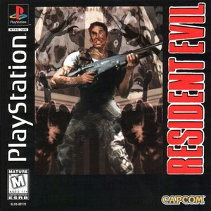
Resident Evil

"What else is scary!?" we can imagine a Capcom executive shouting at the board meeting for Resident Evil's cover. "We have zombies, claws, and wild eyes mashed together – but what else could we add?" A perky young upstart raises his hand: "Spiders, sir – we all hate them!" "Good!" exclaims the executive. "Uh… excuse me," a janitor peeks his head through the door. "I have an idea!" The whole table turns and stares. "Constipation" he says, as he walks back out. And that is the story of Chris Redfield's ridiculous facial expression on the front cover.
Jinx

What's most horrifying about the front cover of Jinx – a very average platformer that only released in Europe – is how morbid it is. As we can see, Jinx is currently hovering over a lava pit, meaning that, yes, we are seeing him moments from death. His life is probably flashing before his eyes, and in a couple of seconds he'll be a molten jester. How did he get in such a predicament? Simple: the King has obviously gone mad, and has gathered up all of the jesters in the land and forced them to compete in a deadly gauntlet. It's like The Hunger Games, except, instead of Jennifer Lawrence in skin-tight suits, it's a load of funnymen.
Croc 2

Yet another game to throw into the '3D platformers with No Personality' pile is Croc 2, which seems to have taken the first few things that the artists could think of and mashed them onto the front of the cover: we've got pirate gremlin things, what looks like the Devil pretending to be Tarzan, and a mine cart chasing scene. Croc, our faithful protagonist, even has his own sidekick – a tiny Honey Monster dressed up in a cute sailor suit. Still, look at how the mine cart gremlin is chasing Croc – could it be safe to assume that Croc's sidekick is actually the gremlin's child? Is Croc our hero after all?
WCW/nWo Thunder

Judging by the cover, it appears that WCW/nWo Thunder is all about a freak electric storm inside the ring that's caused Goldberg to double in size – at the price of his neck. In other news, WCW has decided to go all Cronenberg – the logo has suddenly grown an arm, which Diamond Dallas Page is quick to attack, while The Giant (AKA Big Show with way too much hair) has had his foot welded into the head of [REDACTED], who hasn't reacted well to it. Was this the New World Order that he was hoping for?
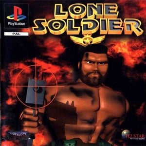
Lone Soldier

Admittedly, when we first saw this, we honestly thought that it was a fake, but it's honestly a real thing. What's most obvious about this abysmal cover art is the fact that our "hero" – if that's what we're supposed to call him – seems to have overloaded on the botox department a little, then got a Simon Cowell haircut and used the spray tool in Paint to fake a beard. His Uzi appears to have been made in Roblox, and his body seems so plastic that it's actually charred rather than burnt. It's safe to say that this Lone Soldier is alone because of how much of a freak he is.
College Slam

This box art starts off pretty innocently: you've got the typical college Letterman font as well as all of the college logos. It starts to get a little weird with the random cheerleader with a College Slam jersey – undoubtedly worth millions by now – and then you look further down the cover and OH HOLY JESUS GODDAMN IT'S A BASKETBALL WITH TEETH EATING A HOOP. We have no idea why this particular idea was chosen, but we guess at some point one of the designers dropped some acid and came up with this little number.
PO'ed

"Friggin' aliens!" the cover shouts, desperately trying to be youthful like a 45-year-old man that rollerskates. What's most striking about the box is that it honestly doesn't know what it's supposed to be. A chef with some serious mutton chops shooting a splooge monster while simultaneously offering a frying pan to some hungry (possibly mutant) patrons is crazy enough, but look around and you see some even more random things – a green spaghetti monster with eyeballs, for instance. We'll let you scour the stupid cover and discover the rest of it for yourself.
Mobile Light Force

Starring a knock-off of Charlie's Angels, despite the age rating saying 'Everyone', it's pretty obvious that Mobile Light Force is aimed at 8 to 12-year-old boys and no one else, thanks to its combination of explosions, guns, killer robots, and scantily-clad-in-no-way-fit-for-battle women. These ladies may as well be blind, seeing as they're firing in the complete wrong direction and seem to not be panicking at all, despite the fact that shots are ricocheting right next to them. It's that reckless nature that makes them so bad ass, we suppose – or straight-up stupid.
Jounetsu Nekketsu Athletes: Nakimushi no Coach no Nikki

Of course, no obscure cover art article would be complete without a good old Japanese front cover – and the ostentatiously named Jounetsu Nekketsu Athletes: Nakimushi no Coach no Nikki is a real humdinger. The uniform says coach and athlete, but these two are more than that, as evidenced by the hand holding. We're not sure what they're pointing at that's bringing tears to their eyes – it could be a beautiful fireworks display or it could be a javelin heading right towards them. Either way, we'll let them enjoy their obviously very important moment.
Which of these boxes do you reckon is the worst? Are you aware of any other atrocious pack shots for the PSone? Cringe at some covers in the comments section below.
Which of the following do you think is the worst PSone cover? (43 votes)
- NBA Showtime: NBA on NBC 0%
- Resident Evil
- Jinx
- Croc 2 0%
- WCW/nWo Thunder
- Lone Soldier
- College Slam
- PO'ed
- Mobile Light Force
- Jounetsu Nekketsu Athletes: Nakimushi no Coach no Nikki
Please login to vote in this poll.


Comments 29
Great article, @AnchorSam_9. I love the College Slam one best, but they're all pretty ridiculous!
I always hated but loved that Resi 1 box art. I've never really assumed the guy on the front was Chris, since he doesnt look like either the actor or his character model. Plus it always bugged me that the gun that he's holding was never in the game. Still, it's somehow a great cover!
You missed the cover to Tomb Raider. The game itself aside, that is one dog of a cover. Like looking at crap with a mint stuck in it.
I actually dig Croc 2's cover. Don't mind NBA Showtime, either. The rest though? Mostly yuck. I ended up voting for Jinx. That cover really bothers me for some reason.
@Johnnycide It's not THAT bad - although the lens flair is certainly dragging it down!
@DRL I'm not sure if "best worst" in the title means the covers are bad, but we like em anyway.
@kyleforrester87 crapmint! Crapmint, I say!
Seriously though, I know it's not the worst cover ever but for some reason it's always annoyed me to look at.
I thought Irritating Stick would be on that list, that cover smacked of cheapness.
@adf86 It's a good shout. Awful:
Everyone always forgets that the Saturn game with the worst box art ever was also on PlayStation.
http://www.gamefaqs.com/ps/196854-bust-a-move-2-arcade-edition/images/box-12062
Absolutely brilliant article @AnchorSam_9, what a hoot!
@get2sammyb That cover looks like the view of someone who picked up a cattle prod and took MDMA. Good pick @adf86
Thanks for all the suggestions! For the record I voted for Lone Soldier, but Jounetsu is a thing of beauty isn't it?
@CrazyOtto Haha, I've never seen this one before. Brilliant:
Keep the submissions coming, this is one of the most entertaining evenings of my life!
@Bliquid this comment is beautiful
just found this o_o its uh.. intresting https://bluespyro.files.wordpress.com/2011/08/spyro-the-dragon-2-riptos-rage-cover-jpn.jpg -sorry dont know how to make pics visible in the coment
Oh God, these submissions are all hilarious! That Bust-A-Move 2 one's horrifying though. O_O'
I don't see what's wrong with the Croc 2 one though, maybe because I grew up with platformers that had boxes like that. I mean, the main PS1 trio; Spyro, Crash and Rayman aside, it's typical of platformers of the era...
Found another one. https://i.warosu.org/data/vr/img/0022/65/1425461840892.jpg
@CrazyOtto the playstation 2 bust a move art was somehow worse. I know, almost impossible, but it was.
@get2sammyb is that Natalie Portman on the front of Forsaken? Damn. Hope she was well paid.
Also;

check out this master of martial arts perfect form! lol also the game was awful lol
http://s.emuparadise.org/PSX/Covers/Perfect%20Weapon%20[U]%20[SLUS-00341]-front.jpg
@Johnnycide Kinda looks like Keira Knightley to me but that game came out in 1998 and she was like 13 or something. Lol
Oh my God, terrible box art is one of my favourite things in the world. Day made.
Filarious!!!
@kyleforrester87 haha, I remember going to Blockbuster to hire it, and after hearing my mate wax lyrical about its greatness for weeks, I was convinced I had the wrong game considering how sh*t the box art was
I absolutely LOVED PO'ed. I mean, it was a terrible, awful game. But it knew exactly what it was. It was silly, it was stupid, it was fun. Plus it was one of the first FPS's I'd played that really had an element of verticality in the level design. That jump pack rocked!
Here are a couple I'd like to throw into the mix:
See guys? 3-D!!! You guys like that, right? Well then you'll LOVE this, as it's 3-D.
Mindscape presents: Chess With A Paedo
@glassmusic GANDALF?!
Show Comments
Leave A Comment
Hold on there, you need to login to post a comment...