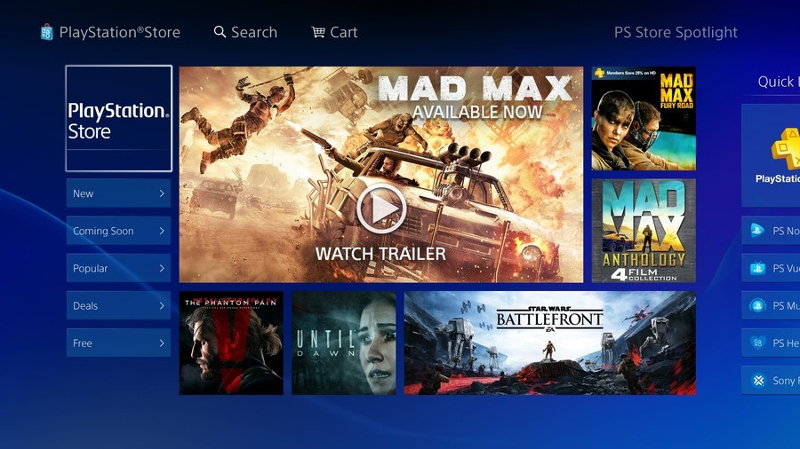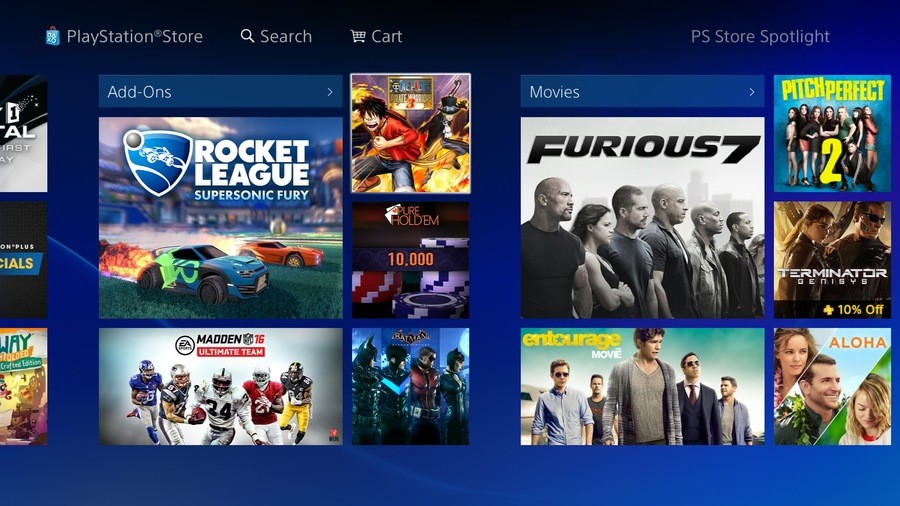
Don't quote us on this, but one of the things that Sony touted about the new PlayStation Store when it rolled out on the PlayStation 3 was its ability to adapt the design without needing to deploy firmware updates. It appears to have taken advantage of this functionality, as the online plaza has been given a bit of a spring clean in North America – well, on the PlayStation 4 at least.
Don't get too excited: it's still the same application, but the design has been altered a little bit. We'd argue that it's much busier than before, but the platform holder's included a ton of Quick Links to help you to get around. It still favours the hottest new releases, so you'll be needing to use the search button for more obscure stuff, but it seems much better than the European alternative.
What do you think of this subtle redesign? How do you think that Sony could improve the PlayStation Store? Add to basket in the comments section below.


Comments 17
as long as they improve the search function so you can actually type what you want instead of being forced to type only certain things then I would be happy
Looks nice!
I just wish they'd move the icon back on the main menu.
Categories need to be sorted on the EU store and the search function. Other than that it's decent. I prefer the web store personally.
Biggest problem the site has for me is the sluggish performance. They should make that a priority over a redesign.
@mineralrich On the PS4? I think it's pretty snappy. It's horrendous on the PS3, though.
Sometimes the ps4 one is a little slow to load images - slower than I'd like anyhow. Way better than ps3.
Still no wishlist, no gifting, cross buy ps+ freebies aren't listed prominently, etc.
@get2sammyb Sorry, I meant the browser version (using Chrome). I actually prefer to buy stuff using the web interface. Browsing natively via the PS4 has good performance. But I like using keyboard and mouse .
@get2sammyb I also thought your post meant the browser-version had the design facelift as well. I checked it and it didn't. It could use both a performance boost and design makeover .
And...the PS4 store looks awfully like the Xbox One interface...
@mineralrich
That's ok. The new Xbox UI that is coming in November looks a little like the PS4 UI.
I wish the PS3 store wasn't so laggy, but good news for PS4 owners. (^_^ )/
@Utena-mobile The PS3 store UI is hopeless. At least the web store makes it easy to queue up downloads to the PS3 and it works very well (especially when you scheduled your PS3 to wake up for updates and queued downloads).
I just picked up an Xbox One, so its "Modern UI" is fresh in my mind. I haven't looked at the Windows 10-based UI changes yet.
Thank god the old layout was awful.
Also you can't buy ps vita titles from the ps4 store, but you can from the web.... while I'm griping.
I saw it last night and quite liked it, i still wish that the trailer boxes would just let me fullscreen it without going to the gamepage though.
I honestly don't have anything to say about the store layout on the PS4. I just use the PSN app on my phone to browse and buy things from the store.
They're getting better with their use of space. I felt like a toddler every time I went into the PS4 store and saw those huge vertical banners taking up screen space. We get it--you don't have to blast them like we're blind.
if they still didn't change the search function, they can go straight to hell. I hate the current search function, it's just awful and on top of that it was on the PS3 as well and even then I freakin hated it.
Show Comments
Leave A Comment
Hold on there, you need to login to post a comment...