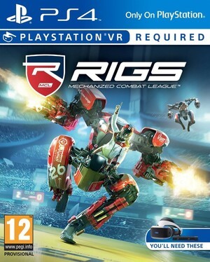
Towards the tail of the generation, PlayStation 3 box art got really bad. You'd have the PS3 logo, the PlayStation Network logo, the 'Only on PlayStation' logo, the PlayStation Move logo, and more. Just take a look at the state of this Need for Speed Most Wanted cover if you want a particularly egregious example.
With the PlayStation 4, the platform holder's got back to basics. The PS4 logo's there, accompanied by 'Only on PlayStation' for exclusives – but that's it. There's no PSN logo on the front – heck, the platform holder rarely includes the Sony Interactive Entertainment logo, opting instead to amplify the developer.
But with the imminent arrival of PlayStation VR, things are about to get messy again. Take a look at these covers for RIGS: Mechanized Combat League, Super Stardust Ultra VR, Hustle Kings VR, and Until Dawn: Rush of Blood. The patronising 'You'll Need These' stickers are back, as are the bumpers beneath the platform branding.
We understand that all of this is necessary information, but… Bleurgh!


Comments 22
Kinda salty that RIGS requires PSVR. The game could do just fine without it.
@vagineer1 Nah, it wouldn't be the same. A lot of that game's appeal is the novelty of playing it in virtual reality, I think.
I can only hope that the game and PSVR drops in price then as right now it seems a tad bit expensive.
They should make small icons and put it higher on the box art, for example above the "only for palystation"
I don't think the banner along the top is too bad, but the "You'll need these" icon seems excessive. They could have put that on the back.
But as MadAussieBloke says, general shoppers are terrible at this sort of thing. When I used to work in HMV, people would mistake Wii U games for Wii games, they'd pick up special editions thinking it'd be the standard price... So many examples of either misreading things or poorly communicated info.
I used to love watching people walk in the main entrance, where all the latest games were on display front and centre, then walk up to me, ask where a newly released game is, and I'd have to walk them straight back to the main entrance and hand them Shoot Em Dead Ultimate HD Remix Platinum Edition, or whatever. It really doesn't surprise me that a) this much info is packed onto the front cover, and b) that parents infamously buy the wrong games for their kids at Christmas!
While we don't need it I think this is necesarry so parent don't accidently buy ps vr game thinking that it can be played without vr. The "You'll need this" is a bit excessive thought.
Agreed, it needs the attention because it requires something that didn't come with PS4. And you can bet that there will still be loads of returns from people who say "Sure, it said it on the front, but I didn't realise it actually "needed" Playstation VR!"
This is 100% necessary when you consider the absolute volume of morons that are alive in the world.
Dumb customer: "i bought this game from you guys but no one told me i needed the kinect to play it.
Me: sorry, they really should put indicators like a message and different coloured box to let people know! 😒
DC: so I'd like a refund!
Me:..."
When I worked for pizza hut, people would sometimes ask which box the pizza was in when I delivered. A massive pizza box and a small breadstick box apparently don't make it easy enough to tell the difference. "What's the difference between sausage and pepperoni?" was also common. People can be denser than lead.
All they had to do was make the design for VR games different. Don't put the PS4 at top, put "PLAYSTATION VR" at top in different font or something. Keep the games segregated at retail. There ya go.
It needs to be clear nowadays else morons would sue. If the typography was too subtle - that could be used in court, citing 'non-accessibility' issues or not clear enough for poor sighted people. I've had to work on stuff which kills lovely artwork... such designer pain!
Sweet, since it only says I'll need the headset and camera for those games, I won't need a PS4 console or controllers, right? That'll be a moneysaver!
@JaxonH Nah, keep the "PS4", they'll need to switch that out for PS5 or NEO in the future
I don't mind the little banner on top, but I agree with what others have said, the "you'll need these" is a bit excessive.
I don't think the box is bad. Cluttered sure, but in a good way.
Who cares ? I play the disc in the box .... so I have no concerns of what the box art looks like, are some people that shallow ?
the ps3 logo looks way better than the ps4
the ps3 logo looks way better than the ps4
I miss the playstation network ps3 logo.and the red ps3 box art
@vagineer1 I agree. I'm very disappointed VR is required for RIGS. I would definitely buy it otherwise. Looks like the next Rocket League.
If we are talking about VR games that won't play on a Standard PS4 without VR, then I would say that's pretty important information, not messy. Print it loud and clear.
I can understand the banner for "required" and "compatible" but the "you'll need these" is really unnecessary, especially when most people can look up the entirety of human information within seconds.
Agreed - this is just for Thickie McThickisons out there who will demand refunds after licking the disc or something and want a refund as they don't have PS VR.
Leave A Comment
Hold on there, you need to login to post a comment...