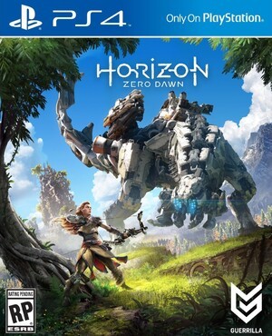
Horizon: Zero Dawn's new trailer may be a bit on the cheesy side, but there's no denying that the game's a visual tour-de-force. Part of that, of course, stems from Guerrilla Games' technical prowess – but the art direction is also a very obvious highlight as well. It's no surprise to see the title score some stunning box art, then, which was officially revealed today alongside the title's release date.
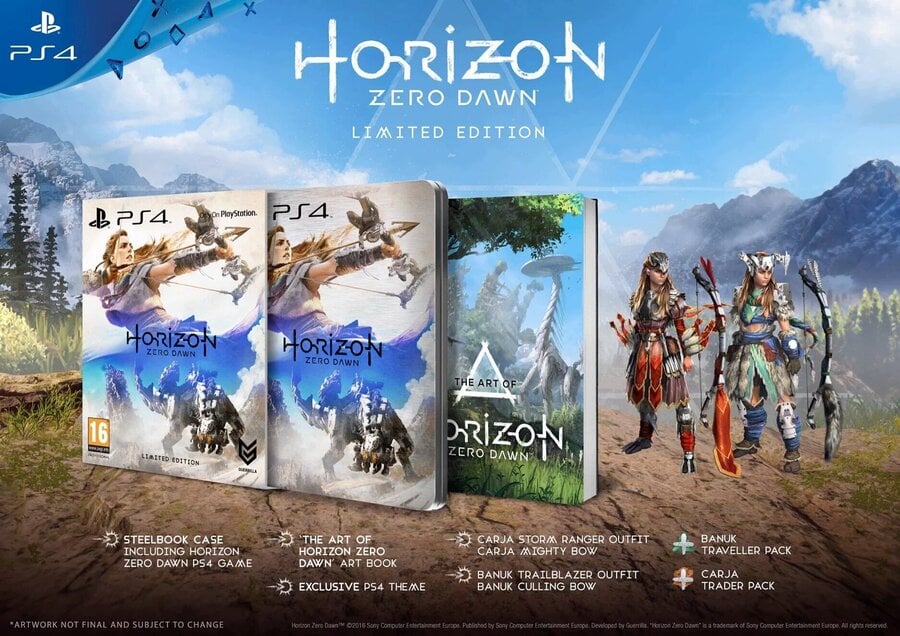
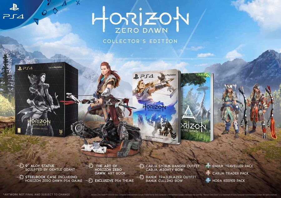
The game's also getting a couple of collector's editions. The Limited Edition ships in a steelbook case and comes with an art book, an exclusive PlayStation 4 theme, and a bunch of in-game content, while the Collector's Edition – which will retail for $119.99 in the US – comes with all of the aforementioned, as well as an Aloy statue crafted by Gentle Giant.
As announced earlier, the promising exclusive is due out on 28th February in North America and 3rd March in Europe.


Comments 14
Oh dat game. Didn't remember it existed but now I remember it looked good.
Why is Sony showing so much of Horizon today?
Just to damage control the delay?......or is the title skipping E3's main show?
@sub12 Damage control the delay I think. Get all the pre-order stuff live on Amazon, etc ahead of next week's stage demo.
I wish this game would release this year!!! And...honestly I don't like the regular box art...the character is just staring into space, and the title of the game is pretty small. The steelcase, on the otherhand, looks really slick (although the title is still kinda small, imo).
I am interested in the Limited Edition - don't think I will add another dust collecting statue to my house though. Loved the new trailer as it gives more indication of the story and a better insight into Aloy. Doesn't look quite as impressive graphically - particularly the characters and robo-dino's - as the E32015 reveal overall - a visual downgrade? Video compression?
Still very hyped for this - more so with the new trailer...
@nyarth was literally going to comment with the exact same points you made! I'm not a fan of the normal design at all but I do like the look of the steelbook much better!
This might be PS4's best game cover yet.
Cover art 8 months in advance? I'm still waiting for Zelda U to get a proper title.
@KingofSaiyanZ Probably better not knowing, "Zelda for Wii U" and "Zelda for NX" isn't exactly tickling my fancy.
n.I.c.e. box art.I love ratchet and clank box art also
I love that box art. Will just get the standard edition, as usual. I always find it funny how the Limited Edition art book in these promo pictures looks like a really thick 200-page tome and then the final thing is tiny and about 30 pages long.
One of the more refreshing Cover Art. Love it!
@Bad-MuthaAdebisi The reveal and subsequent reshowing of that segment gave us some details on the game-play - different approaches etc and hinted at the crafting/RPG elements. This video seems to focus more on Aloy, her character and the main 'story' - similar in essence to the Witcher 3's trailers.
RPG/Crafting menu's are not all that 'exciting' compared to a 'game-play' trailer so I can understand why developers/publishers tend not to show these. I wouldn't be surprised if that turns up in a 'developer/studio - making of/developer diary' type video later down the line - discussing the crafting, economy, trading etc and maybe another one discussing side quests, levelling/upgrade system etc too...
I love the actiony inspired cover, not to mention the artstyle and colours are beautiful. Other box designers should take note.
Show Comments
Leave A Comment
Hold on there, you need to login to post a comment...