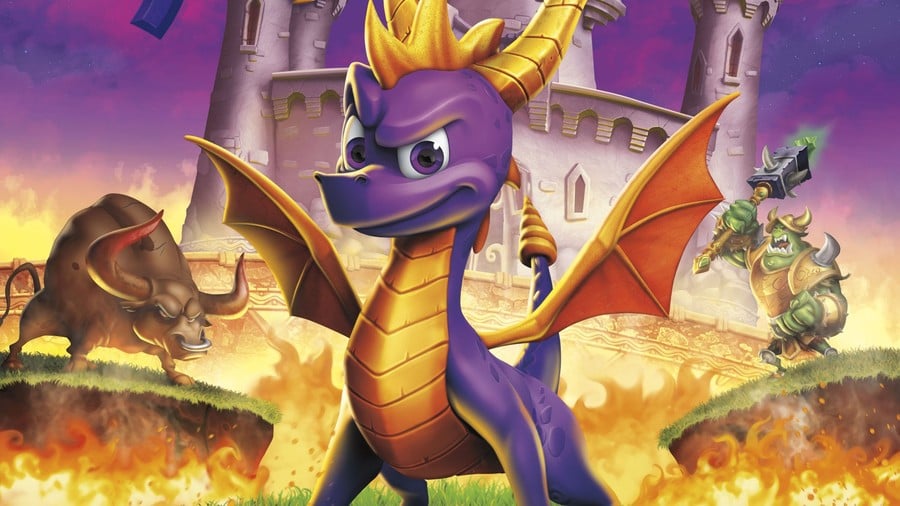
Just as Vicarious Visions did with the original artwork from Crash Bandicoot's PSone trilogy, Toys for Bob has recreated Spyro's box art from the first three games, and they look excellent. Take a look at each of them below:
But some of the impact is lost unless you can compare them to the originals, right? Well, Reddit user IanMazgelis has compiled the three images along with the old artwork to give a clearer indication of how beautifully the art has been scrubbed up.

It serves no purpose other than to get everyone all nostalgic, but what's wrong with that? These look great, and makes the wait for Spyro: Reignited Trilogy that little bit harder. Do you like the look of these? Which of the three games was your favourite back on PSone? Put on your rose-tinted glasses in the comments below.
[source twitter.com, via reddit.com]


Comments 7
Activision should release spyro special editon with artbook, manual, and ps1 case, I'll buy it as long as it priced below $100
The second game is wrong, it still doesn't say Gateway to Glimmer
The comparison image is so good.
Please don't port beg. If you want to find an answer to your question, perhaps you should ask over at Nintendolife. Thanks for understanding -Tasuki-
@adf86 Looks right to me 😂
"But some of the impact is lost unless you can compare them to the originals, right?"
Also the fact that I'm not American, as you assume everyone reading this to be.
Damn what a trip down memory lane...and I definitely prefer the remade cover art, no offense to the originals.
Show Comments
Leave A Comment
Hold on there, you need to login to post a comment...