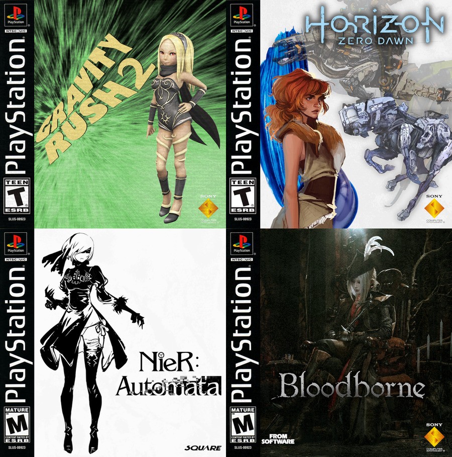
The likes of Horizon: Zero Dawn and Bloodborne are great PlayStation 4 games, but what if they’d launched on the PSone? Reddit user IanMazgelis has reimagined the aforementioned exclusives, along with Gravity Rush 2 and NieR: Automata, with some fairly authentic looking 90s cover art. The results speak for themselves:

How do you picture these titles playing on Sony’s first-ever console? Wear your rose-tinted glasses in the comments section below.
[source reddit.com]


Comments 19
I can safely say all 4 of those titles would have been disasters on PS1 😂😂.
Methinks the artist is a fan of the old ‘waifu’ looking at the choices they’ve made there
That BB cover looks gorgeous.
That HZD cover looks like an image ripped of Red from Transistor. And Kat looks a little bit creepy for some reason. Like something is out of proportion.
I hate gravity rush cover, it remind me of ico usa ps1 cover 😕. I think japan ps4 cover for each games is better than the one we have here, the case itself is good though because ps4 bdray case is cheap looking.
The Gravity Rush cover sucks but I love Gravity Rush so much
These are fantastic aside from Gravity Rush. I especially love the Bloodborne one. Almost enough to think about buying one if I can find it on E-bay or something.
@Nyne11Tyme - You sure? Sure, Horizon might take a bit of creativity, but Nier and Bloodborne could surely be adequately re-done without too much trouble, given the games that came out at the time (haven't played Gravity Rush).
Nice, I really like that more simplistic black and white Nier Automata cover.
i do these kind of things all the time i actually did one for NieR actually
i kind of wish Sony would go back to this style for the PS5
@FullbringIchigo Yeah thats a real clean look. And we dont have instruction booklets so they can make the cases smaller.
@Flaming_Kaiser exactly and any thing they do have to print they could put on the back of the cover
@FullbringIchigo Totally agree the old ones were nice and clean. The Horizon looks like a RPG cover i love it. 😁
You see the Last of Us 2 without the blue border how much of a improvement that is.
@Flaming_Kaiser you mean kind of like this
@orionreplay Don't Forget The Codebooks You Could Get From Places Like Blockbuster
The cover art is perfect for the time period haha
@orionreplay or full blown walk through books, i feel sorry for people who just look up things online because looking through a walk through book was amazing with all it's fantastic art and pictures and so much information that looking at a text document doesn't compare too
plus the first time you crack it open and get that new book smell
ahh memories
@orionreplay yeah i remember that mine would just be full of bookmarks on certain pages so i could easily find them
i also remember having note pads where i would write things down for certain games especially on Shenmue, yeah i know there was an in game note book but i found it easier to write it all out myself
Like this one this is how the PS4 covers should look.
@FullbringIchigo https://www.pushsquare.com/news/2019/09/the_last_of_us_2_comes_with_a_beautiful_reversible_ps4_cover_in_a_few_territories
Show Comments
Leave A Comment
Hold on there, you need to login to post a comment...