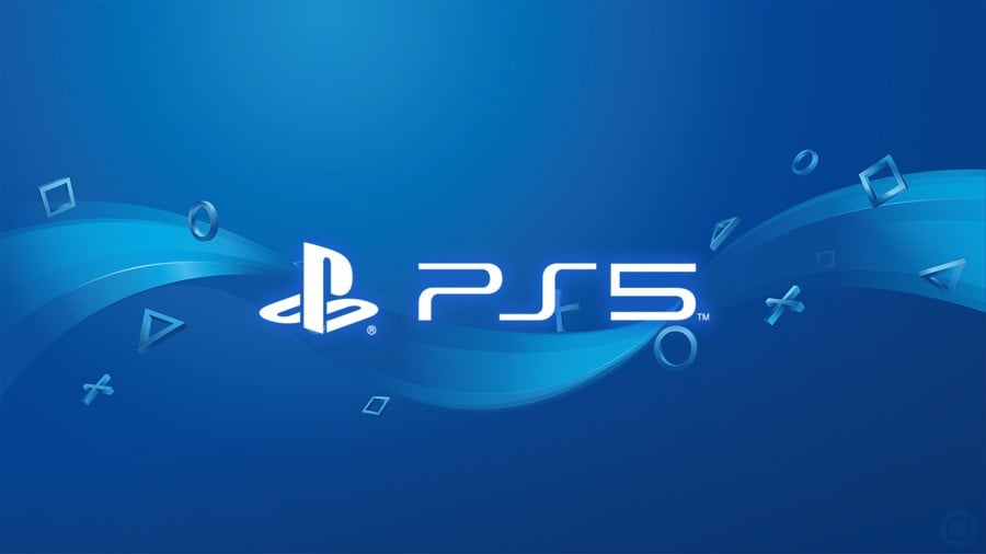
Want an indication of how big the PlayStation 5 is going to be? Sony revealed the system’s logo at CES 2020 overnight, which uses the exact same typeface as the PlayStation 4’s logo. At the time of typing, the symbol has attracted over four million likes on Instagram, and countless more on Facebook, Twitter, and other official social media accounts.
The company’s been using the same font for over a decade now. It all started with the PlayStation 3, when the Japanese giant rebranded the entire platform. Ken Kutaragi’s vision – which infamously included the so-called ‘Spider-Man’ font – was scrapped, and a new sleeker design was introduced alongside the cheaper PS3 Slim console. It’s been the same ever since.

But were you hoping for something a little different with the PS5? Brand recognition is important, of course, and while the primary PlayStation symbol and its famous face buttons are now iconic, its curved font is also heading the same way. Alas, a new generation provides a fresh start, and the company’s graphic design team could have got a little more creative.
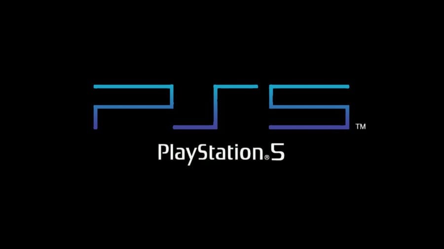
One alternative we’ve seen floating around utilises the PS2’s logo, and it works well with PS5 because of its simplicity. While there’s no doubt fans would have appreciated this reference to PlayStation’s heritage, though, we reckon the current branding works better. But what do you think? Are you happy with the PS5’s logo? Let us know in the comments section below.


Comments 49
Care enough to comment, don’t care enough to vote.
It’s not exactly groundbreaking but it doesn’t need to be. All I ask for is for them to tap into nostalgia damn it! I love the PS2 theme they have already but my dream PS5 would detect which system the disc was from and change visual identity accordingly. I just want to hear that ZOOOOM when you boot up a PS1 game again.
It’s pretty much exactly what was expected. Safe, but impossible to confuse with current gen.
why does it matter its a logo it dpesnt have any function other than to put on marketing
I've already had it tattooed on both my children's foreheads
It's a logo. Totally unremarkable. It communicates what needs to be communicated.
If it ain't broke don't fix it. And given the PS4 has been consistently brilliant and performed well, and given how the Vita confused some and could have been different if it was called the PSP 2 (not saying it would have been, but could have helped some) there really is no need to change things up.
Seems like it's not really news worthy, but I'm afraid I'm already sick of seeing it everywhere on all of the internet. Did anyone really expect anything else?
Well it's a logo. That's a thing. Where do we go from here? A poll on the eject button when it is shown? 🤣
It could be in absolutely any font, Chinese symbols even and I’m still buying it. Just show us more games already!
@JohnnyShoulder Well the eject button on the original PS4 was quite poor. Good thing they changed it for the Pro and slim.
A thousand monkeys working at a thousand typewriters wrote the greatest novel known to man. And then when they were finished they designed the PS5 logo. It was the best of times, it was the blurst of times.
@mookysam Mookysam, you will find true love on flag day.
@Gremio108
This should be mandatory practice. Let me go ask my wife how she feels about it
too small
It's fine. I really don't care either way.
It's simple, but simple is fine in this case.
@Ralizah
@Octane Very cute. Make that yourself?
@Ralizah It communicates what needs to be communicated
@Octane I dunno. I think it also communicates: "We allowed our logo to be designed in MS Paint."
i don't even get why people are so over dramatic about it.
i mean what did you expect the ps5 logo to look like?
the gaming community realy are a bunch of crybabys at times.
It's amazing now it finally level up, joking aside like everyone says if it ain't broken don't fix it, everyone already recognized the brand and knows what follows unlike Nintendo and Microsoft with dumb names especially Xbone series X
Font is now synonymous with PlayStation, why change it?
I'm just happy I learned the PS5 will have a 4K Ultra HD Blu Ray drive.
Does anyone even realize the font used in the graphic for this article is NOT the PS5 logo!! The "5" is clearly different with squared off top section, whereas the actual "5" is rounded in the middle section. D'OH!!
Also why isn't the Vita shortened to PSV like every other PlayStation product?
Looks great like PS4 logo and PS2 logo.
@ShogunRok You are the font of all fonts.
I can dig it.looks cool.classic logo.word up son
Looks fine. I say “good”. It’s exactly what I would expect for the PS5, and that is fine.
It's perfect. No need gimmicks. I could think of some nice art style for the SeX though.
This comment section... 😂
The sarcasm is so thick.
On subject - the only way they could have ruined the logo was to make it red or green.
Wish they would just do the reveal already. Sick of seeing videos and articles on the next gen consoles none of which are based on any facts at all. So hurry up Sony put all the fake news articles to bed once and for all.
Meh, and I don’t care. In fact I’ve ever cared about the box. It’s what’s in the box that I care about.
@jdv95 not just the gaming community. It’s Twitter. Any time Twitter is involved in something it becomes bigger than it really should be and gives those idiot fuel to want to do it more and more.
The logo could be two dildos and I'd still buy it.
The PS5 logo is FINE. However, I would've preferred something novel, since we've seen a transformation of the logo from 2-3. If the leap from 4-5 is as big as they say it is, shouldn't we expect a new logo to go along with it?
I suppose it could also be said that it makes perfect sense to retain the old logo because of how much PS users identify with it already. Striking out a look that is so closely tied with success may not be the smartest thing to do when jumping to a new generation...
Still, the reputation of PS is such that many people will buy the new console no matter what. In fact, I'd personally wager a difference in persona could only add to the intrigue, not take away from it.
I totally dont care but i suppose now that im thinking of it i think itd would have been really cool to use the classic/same font just as theyve done, that keeps it consistent and famiar but to then add a bit of extra little flair/details to it to keep it old yet new at the same time
It's just a damn "logo". Why should we even pay any attention to it?
I mean. What's to say.
It's a good logo, because when they created the original, it was a good logo.
Nothing else to say really.
looks too much like a 6 from distance
Well, it's a logo for sure, I don't have problem with it.
I still miss the colored logo
If you can spin it like on the PS2 then it's a winner.
You're getting a bit desperate for content now guys. I am eagerly awaiting the six articles about what font they decide to use for the word OPTIONS on the DS5
Best left as it is. Not everything needs to be reinvented every damn time. It looks crisp, modern and simple - and therefore needs no adjustment or pointless gimmicks thrown in.
like i said before
"invokes the second PS3 and current PS4 logo, consistent with the brand and tells you exactly what it is
it's perfect"
i care as much about the logo as i do about the screws logo on the inside of my pc case under my desk
I don't care about the logo. I am not surprised by the logo. Even if Sony went with something different, it wouldn't bother me.
Show Comments
Leave A Comment
Hold on there, you need to login to post a comment...