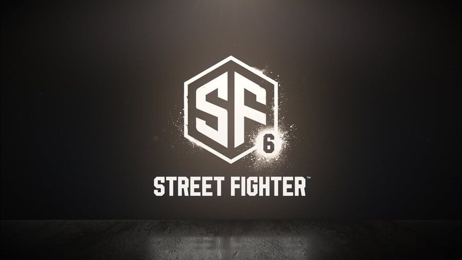
If we’re honest, there are more people talking about Street Fighter 6’s logo than the actual game. To be fair, Capcom’s late night reveal didn’t give us a fat lot to chat about: Ryu’s still got his beard, has a pretty wide torso, and newcomer Luke is returning to the fray. The logo, however, has become a huge talking point.
Street Fighter is, of course, historically known for its flashy fonts. This comparison, edited together by Reddit, shows the dramatic change:
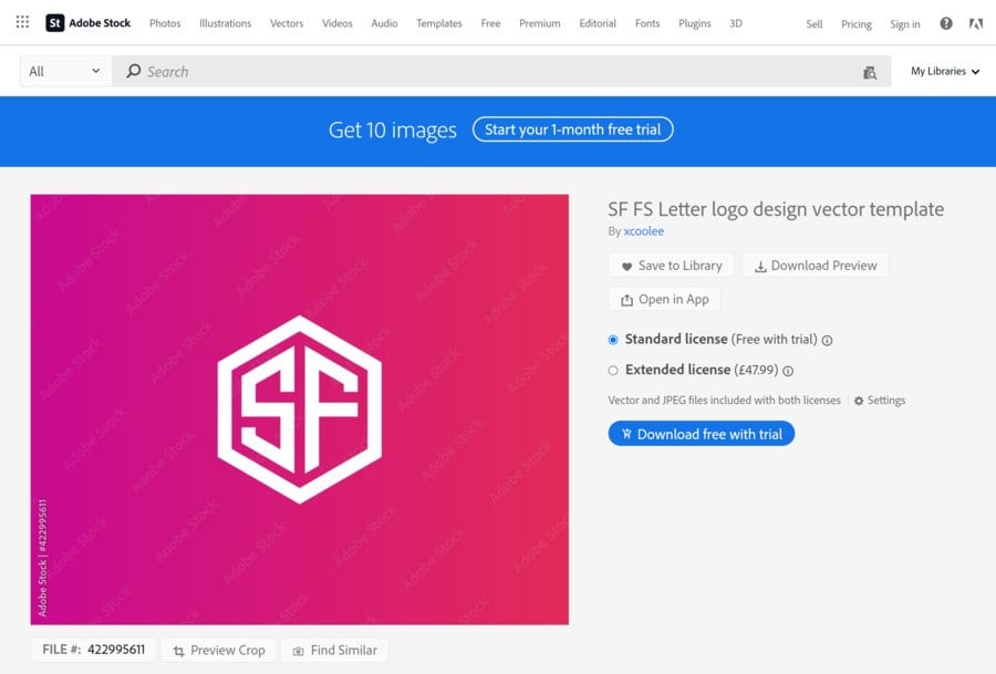
Our initial impression is that it’s extremely esports flavoured: the kind of emblem you could easily add on jerseys and such. We’re not sure why, but it gives us a free-to-play flavour. Perhaps more surprising is that it’s literally based on an Adobe Stock graphic, which can be purchased by graphic designers for £47.99, or your local currency’s equivalent. To be fair, Capcom has thrown the “6” on it, and there are some subtle changes to the thickness of the characters and the angles of some of the lines.
But yeah, it’s very nearly identical:
Subscribe to Push Square on YouTube167k

Already fans on Reddit are mocking up edited versions of the logo, which add a little more flavour to the mark:
We’re going to assume that the logo in the trailer is placeholder, especially seeing as it’s been practically pulled from a stock graphic design library. We know times have been tough at Capcom, but we’re pretty sure it can afford a better custom logo for the latest entry in one of its flagship franchises!
[source stock.adobe.com, via twitter.com]


Comments 35
Times must be really tough at Capcom these days…
Hahaha, guys, it looks like Street Fighter has 6 new messages! Guys, do you see it? The 6 looks like a notification icon!
Pretty sure no one's made this joke yet, and I definitely haven't seen it at least 500 times on Twitter!
I think im the only person who actually kind of likes the new logo.😅
I mean in the end it doesn't really matter anyway but I think the only reason people are paying it so much attention is because there wasn't any gameplay footage.
Well, internet made they change Sonic's teeth for the movie. So there is hope we get a real Street Fighter 6 logo.
@Korgon Really its so boring its so bland.
I don't think times have been tough for Capcom, I'm fairly certain they've been making good profits of late.
The logo does look boring. I guess we just wait for more info in the summer.
@Flaming_Kaiser
I think it's because this is the first new SF from a lot of new blood at Capcom's fighting game division as well as a new look for the series since it looks like it's using the RE engine. I actually dig the graffiti tag on the street idea considering it's called...ya know...Street Fighter.
I don't know it just doesn't bother me much at all. And if their intention was to appeal to esports well I mean esports is pretty big these days so I don't really blame them.
That mockup logo has the fun factor that the previous logos had.
Hopefully “xcoolee” got paid decently for their efforts and not just in “exposure”… 😅
Made me instantly think of Sucker Punch games logo… a little different but still
Meh, as long as the game is good, idrc about the rest.
Any publicity is good publicity. Might be very intentional.
Yeah, I'm also betting on the new logo being a placeholder.
The old logo is too iconic for Capcom to get rid of it.
damn if they can’t even not half ass the logo …. and SF6 is directly after that train wreck trash SF5 …
ugh , i’m trying not to be pessimistic , but can you blame me ?
@Lup ah so it’s only giving just me anxiety . 🤣
Who cares what the logo is like, as long as it's the best fighting game ever...
Free to Play is fine. Fighting games need many people to function for multiplayer. Fighting games used to be more popular but become a bit more niche with the decline of arcade.
@Filth_Element and for me it made me think of the Shaw brothers logo, when now I realise is quite different. Oh well!
First thing I see is it looks like Six notifications.
No one else will have spotted that. Or made a joke about other people spotting it so I first on both counts. Honest.
Joking aside it’s just lazy and horrible that they signed this off.
Makes me wonder what the menus and game will look like in general if this is the direction they went
@Korgon I just find i so boring look at the SF5 it has some identity this looks like a placeholder just like some studio's logo Bandai Namco. But its really how i see it.
lol at the gate keeping of the “art business” in the comments. A load of suits picking out a logo from a bunch of logos for their multimillion pound franchise is the definition of high art.
As a graphic designer myself, I'm a bit disappointed by this Street Fighter logo, even if it does turn out to be a placeholder. I mean, come on, Capcom is developing a new entry in a decades-old franchise, surely they had tons of time to finalize a new logo that would be instantly recognizable. Don't bring it possibly being for e-sports into it; this isn't even suitable for a tournament, let alone a new game in an established franchise. I know 'minimalist' logo design is a current trend, but it worked for Nissan and Kia, it doesn't quite work for Street Fighter.
We've seen fans fix broken games, now they're making game logos for tired, tapped-out developers...
Wasn't Capcom also busted for stealing art assets for RE8?
Making more money than ever! Let's make Steve from accounting to make a logo...
Logos of most companies are terrible anyway. Some used to be cool (MS windows comes to mind), but then they became completely forgettable.
Plus, they don't affect gameplay in any way, so this is just internet people looking for something to complain about.
@thebizniznizbiz exactly...
@ShogunRok I think I recall someone making that same joke on Nintendo Life, yesterday, sorry.
Don't know if you've noticed @ShogunRok, but it looks like Street Fighter has got six notifications lol
@get2sammyb @ShogunRok Street Fighter's been ignoring it's messages for a while now it seems
I feel like this logo represents a work in progress, under construction if you will. At the end of the day it's about gameplay and content. If those things are as half baked as this logo then we have a problem.
lame logo and lame announcement. what i was surprised to see was the same old ink spatter particle effects too. we have been looking at that since sf4 well over 15 years ago! i thought it would finally be time for a new look.
@Porco it’s because SF4 was such a legendary and successful game . long live the king .
I thought it kinda feels more like a Shaw Brothers homage, no?
@mrtennis1990 someone said "street fighter has 6 notifications" LOL
Show Comments
Leave A Comment
Hold on there, you need to login to post a comment...