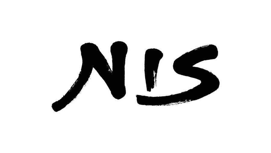
Nippon Ichi Software — or NIS for short — has revealed a new company logo (as seen above). Here in the West, the Japanese publisher is best know through its US-based arm, NIS America — which this new logo applies to, as well as its European counterpart.
NIS is most widely known for role-playing games like Disgaea. It also publishes titles such as Trails of Cold Steel outside of Japan. NISA is coming up to its 20th anniversary in 2023, hence the change.
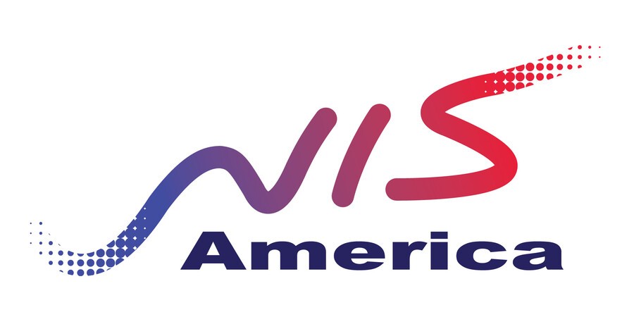
For comparison, here's the old NISA logo:

An improvement, we think. This new logo's got a simple elegance, and we like the brushstroke effect. It's also interesting that the 'America' part of the logo appears to have been dropped entirely. This is also the case on the company's official social media accounts.
Are you a NIS fan? Show us your own artistry in the comments section below.
[source nisamerica.com]


Comments 18
Simple but effective. I like it.
That's neat....Now hurry up and localize the Trails series. You're about to be 3 games behind in the West 😁
Looks nice. Super pumped for Trails from Zero!
It needs a bit of colour. The font is good though. Seems most companies are going for simpler plain logos. I like a logo that makes my eyes bleed. I am probably in the minority on this though so bland away with your logos.
Not really a fan of minimalistic redesigns of iconic logos, but I've seen worse.
Take out the i and add the a and you have nas the g.o.a.t 🐐 👑.greatest rapper of all times follow by rakim.the nis logo is cool.all black platas.word up son
Looks just like the developer Gust label. It’s Simple and tasteful. Not going to match the rest of my NIS America games in my collection, but I still like it.
NIS
PATRIARCH OF THE NIS FAMILY
@nessisonett Hahahaha!
If you flip your monitor upsidedown the new logo says "SIN". Secret message! What could it mean?
The logo guy should give his CV to Capcom.
THAT'S A NISE LOGO
The brushstroke style is a better match for their Japanese logo which also uses that type. Makes sense for a bit of consistency.
I really like this logo. The old one as cool too but this one looks more… how do you say, more elegant/refined perhaps?
You can tell this one wasn’t just made from stock Adobe assets. THERE I SAID IT.
…hey even if it was, it’s still not blatant.
I like it nice and clean. Look at it BandaiNamco and all the companies that make their old ones go away for a bad new one.
Better design but it needs some colour.
For a second I thought it was the other way around and the colourful one was the new one. Thankfully not. Love the elegant simplicity of the new logo, brushstroke feels timeless and unique. Well done
I prefer the old design but that's just me.
Show Comments
Leave A Comment
Hold on there, you need to login to post a comment...