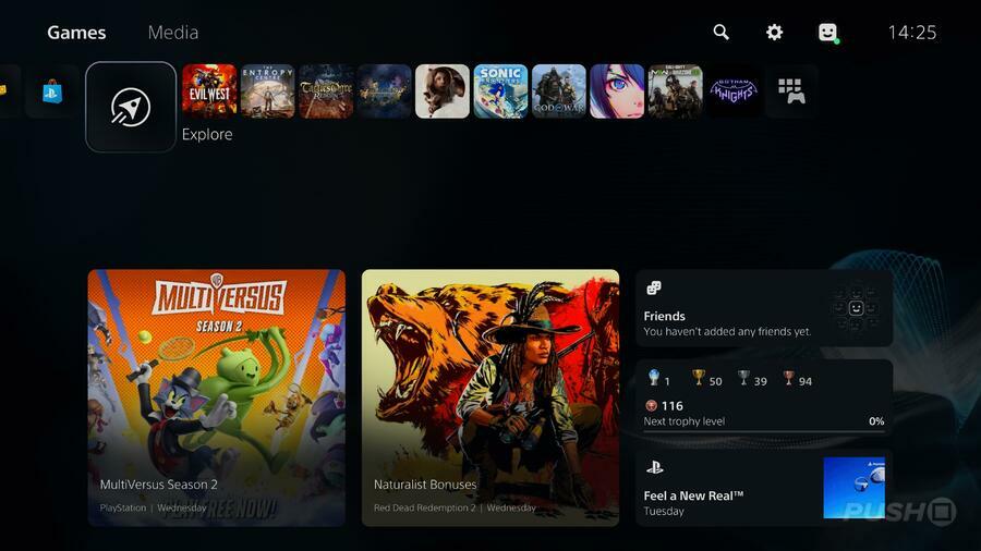
PS5 users across the USA are beginning to notice their Explore page on the console's home screen is being dramatically updated with new information and tabs. Instead of a stream of readily available PlayStation Blog posts, the page details what your friends are doing along with an overall Trophy level that reveals how close you are to the next rank.
If you scroll down the tab more, you'll find news posts from games you've followed as well as official "From PlayStation" articles that play PSVR2 trailers and detail the God of War Ragnarok limited edition controller, for example. Below that are videos from various PS5, PS4 titles that have been captured and uploaded by the community.
The update doesn't appear to have rolled out to every PS5 user in the USA; rather, players appear to be gaining access in fits and starts randomly. Unfortunately, the feature has been exclusive to the US region since the console's release back in November 2020 — it isn't available anywhere else. Instead, there's an Official News tab in the Game Base that acts as an Activity Card.
Should Sony finally decide to launch it worldwide, then the much-updated page feels like a step closer to regaining the information the PS4 system's What's New page displayed. It would show what your friends are up to, displaying the games they've played and the Trophies they've earnt, in a neat timeline. Sony's decision to do away with the feature is one of the criticisms many people have with the PS5 UI.
Have you gotten the updated PS5 Explore page yet? Share what information your tab has on it in the comments below.


Comments 18
This looks great. I think one of my disappointments with the PS5 as a whole is how static and disconnected parts of it can feel.
Not saying this is a huge improvement, but it does make it feel a little more "alive". I'd definitely look at something like this before playing if we had it in Europe.
I think I looked at it once and have forgotten it was there since launch. That said I haven't engaged with any of the more social aspects of any consoles, i'm there to play games not go on another social network. No doubt more useful for others.
@thetraditional PS5 is holding the PS4 back in terms of themes haha. No themes for HFW, GOWR etc all because of PS5. 😠
Just got a ps5 & was wondering where the what's new page had gone also why we can't see patch notes anymore or check for updates on games & apps unless they're on the Home screen , the stores faster than on the PS4 & doesn't crash but there's no option to see demos or new add ons
@TheArt god of war Ragnarok has a PS4 theme but you only get it with the digital deluxe edition
@Would_you_kindly Oh look where they went and hid that. But you know there used to be free or paid themes for almost every game. Basically all games after the PS5 released, stopped making themes. I can imagine how an Elden Ring theme would've been nice!
Awesome! The PS5 interface is finally crafted, but for 2 years I have been staring at full screen wallpaper ads on the Home Screen that are busy, awkwardly placed, and are not all all designed to merge in with the interface (such as https://www.denofgeek.com/wp-content/uploads/2020/11/20201118150822.jpg?resize=1024,576)
This looks 100% better and (I think) clearly paves the way for themes
Looking forward to this new design direction
Ya, I really miss the "What's New" page. It's exclusion has made me feel disconnected on my PS5 since Day 1. Hopefully this fills the void.
I like it personally happy 😊 with the improvement
frankly the whats new page is vital i have no idea why they did away with it. I have no idea what my friends are playing ive lost count the number of times one of them says i completed a game and i didnt even know they were playing it.
Much preferred the home screen of PS4, easier to navigate and understand and just looked very aesthetically pleasing, this has more in common with Xbox home screens which tend to be overly convoluted.
It's a step in the right direction.
PS5 UI needs a lot of work in my opinion, tho as a whole it works. But it’s far from my favorite. I look forward to more updates.
ps4 UI back in the day was the best
-folders
-themes
-what’s new
-friend activities and posts
-web browser
-community
-live from playstation
-facebook
then softy jim ryan came and took it all away
I got my PS5 a month ago and never paid attention to the explore page. But it was very obvious to me that changes had been made. Specifically, the displaying of my trophy level.
It's still not as good as the PS4's What's New page, but it's at least an improvement over the Explore page previously. I was wondering why it would take a second to actually load the page over the last week, but I assume it was because they were working on it.
Now revert the Home screen for each game to what it was before. There's no reason to take away the game's default art as the background and the game's title graphic, and then replace it with Activity Card stuff. The actual Activity Cards are literally right below the Play Game/Resume Activity button.
@thetraditional 100% agreed on the folders. Gamelists are crud and I refuse to use them.
I mean I really like the new UI of PS5 but I REALLY miss the old change your background feature in PS4.
Leave A Comment
Hold on there, you need to login to post a comment...