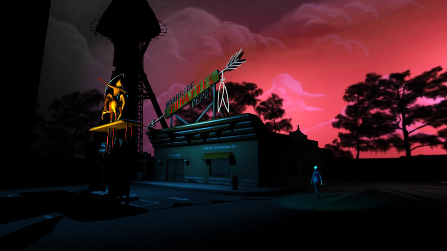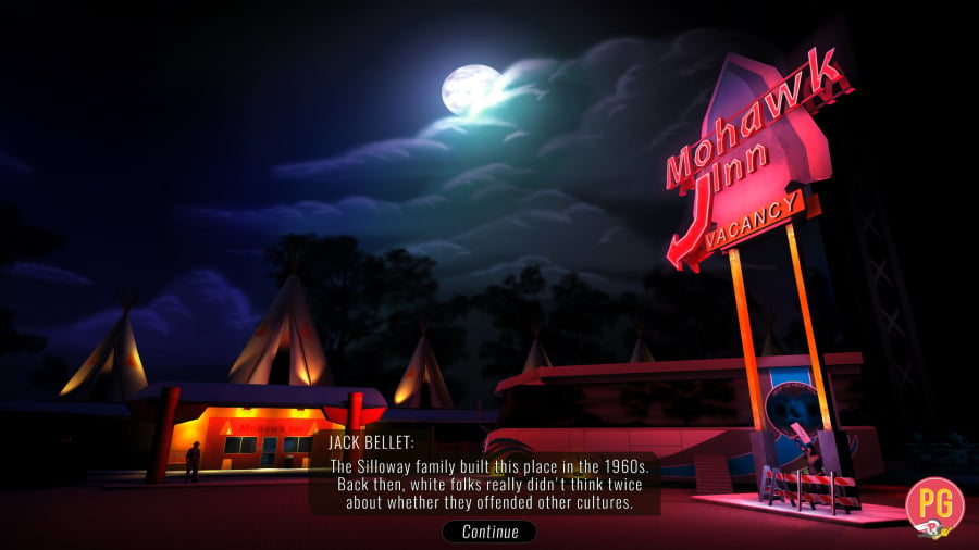
Knee Deep is an odd game. Its particular brand of narrative-driven gameplay is hard to categorise: it's not quite a point-and-click adventure and not quite a walking simulator. If anything, it sits clumsily on the outskirts of the former, not really offering much in the way of pointing or clicking. Originally an episodic PC game, it relies heavily on its cast of shady characters and a twisting, turning tale to hold your interest. Unfortunately, these are the areas it falls flat.
A washed-up actor, Tag Kern, is found hanging from a tower at a decrepit, sleepy tourist trap in the swampy Floridian town of Cypress Knee. This alleged suicide attracts the attention of our three protagonists: millennial blogger Romana Teague, down-on-his-luck reporter Jack Bellet, and no-nonsense private eye K.C. Gaddis. You'll be controlling all three as they snoop around in search of answers and, as you might expect, their investigations slowly intertwine as the story progresses.

You won't be swapping between characters on the fly, however, as control flits from one to the next at set points. The game is extremely linear in that sense, although you do have a degree of freedom when it comes to dialogue. Within most conversations you are given a choice of responses, and some of these choices will affect how other characters react to you or even how key beats in the story pan out. Strangely, outside of one or two critical choices, the dialogue options don't feel as though they branch the story in any meaningful way, most paths leading back to what seems to be a set-in-stone plot.
But these choices aren't the only way in which you can affect the direction. Through the majority of the game, each character needs to compile reports for their respective audience. Romana, for example, writes for a trendy blog entitled Fanrage, and every so often will need to send an article to her editor. You do this based on the evidence you've discovered up to that point, which can vary depending on your choices while speaking to the inhabitants of Cypress Knee. Once you pick a topic, you can choose how sensational your article will be. Typically, the editor prefers edgier writing, but it can also hinder your investigation; the people you write about might not be happy if you slander them too harshly, and will be less inclined to help you later on. It's a neat idea that adds an interesting dynamic to the gameplay.

It's frustrating, then, when this element is dropped roughly two thirds of the way through. We won't spoil the reasons why, but it's a shame that one of Knee Deep's more enjoyable aspects is eliminated entirely for the last stretch. Granted, this is when the story picks up the pace and it makes sense from a narrative point of view. However, its absence brings light to the fact that, actually, the story isn't really strong enough to carry the game. There is one moment near the beginning of Act Three which left us completely flabbergasted and any investment we had in what was happening was lost.
The presentation fares a little better. Everything is set up as a stage production, even going so far as giving you inconsequential choices such as "check your phone" or "eat popcorn" before each act begins. The audience applauds and gasps at appropriate moments, adding a sense of melodrama to the proceedings that lifts the story slightly. We'd have liked Prologue Games to have gone even further down this route, bringing down the curtain or dimming the lights between set changes instead of the elaborate rotating stage they went for. The lighting, too, adds to the overall theatrical feel, used sparingly to set the noir tone. However, the characters themselves sadly let the presentation down. They're deeply forgettable and animated poorly, their movements as wooden as most of the voice acting.
Conclusion
Knee Deep makes a decent attempt at telling a dark, mysterious tale, but underneath lies a bland game with little interaction. The cast of characters aren't particularly likeable and the story they tell makes some bizarre missteps. Perhaps the murder mystery fans among you could get a small kick out of this, but we'd say that most of you can safely ignore this title, knee deep in problems as it is.
Comments 7
Doesn't sound like I would have missed anything, but nearly didn't see the reviews for both this and Earthlock as they are showing in the News section but not the Reviews section.
@es_lion They are in the Reviews section, but that's ordered by popularity. We probably need to add an option so you can view by date, too.
@es_lion @get2sammyb The Cluster-Format strikes again!
I'd love an option to toggle the older style back on, or at least list them in lines like before. Made navigation (for me, anyways) a lot easier. I'M TOO ADHD FOR ALL THESE BIG BOXES ALL OVER THE PLACE! @_@
@Azikira Yeah, noted!
@get2sammyb Ah, ok thanks. It says Latest Reviews at the top and then the month, so I just assumed that would mean that it's like the News page with the most recent at the top. Doesn't that mean though that all new reviews would be posted at the bottom of the month/page, as the fact that they're new would mean that they are the least read? I'd been checking the reviews page and just assuming that nothing had been reviewed since RE7. If you're taking feedback, would suggest defaulting to viewing by most recently posted on each page and have an option to toggle by most popular. Most popular is good for occasional visitors only, I'd suggest, and those of us that visit several times a day would tend to just look for the most recently posted.
@es_lion Not necessarily, but the algorithm may need tweaking a tiny bit.
@get2sammyb Don't get me wrong, the top bar looks great now, and seeing categories is cool, but it's all the odd-shaped boxes all over the place that is really messing with me. A list mode would be perfect for derps like myself. Thanks for acknowledging, though!
Show Comments
Leave A Comment
Hold on there, you need to login to post a comment...