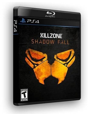
Arguably the most exciting element of a major hardware launch are the minor details that accompany it: the startup sequence, the user interface, and the boxes. Sony’s yet to confirm exactly what form the PlayStation 4’s cases will adopt, but in traditional fashion, graphic designers around the globe have been making some exciting mock ups.
But while not every concept deserves your attention, this Killzone: Shadow Fall idea is the most impressive that we’ve seen thus far. The image centres on the Helghast’s famous glowing eyes as you’d expect, but the effect is really enhanced by the black case and dark banner at the top of the artwork. We also love the subtle use of blue – a hue that Sony’s been using a lot in conjunction with the console of late.
What kind of design and colours would you like the platform holder to adopt with the PS4's boxes? Do you like the look of the embedded concept? Let us know in the comments section below.


Comments 17
What would excite me is if the lower left corner of the case was true.
@Jaz007 Haha, I suspect that this will be an 'M' release!
I would agree with this full black cases but I would like that Blueray disc logo on top to be removed.
That mix of black and blue is brilliant. Great design, definitely one of the best I've seen. Would love PS4 boxes to be similar.
That has to be the sexiest game case i've ever seen. The subtle touches of blue really compliments the black (what doesn't?). I hope Sony goes with this kind of design, I would put all my games on display in wall mounted glass cases.
Just get Olly Moss to design the cover for every game released on the PS4 and they will all kick butt (he designed the Resistance 3 cover) his art work and graphic design for game and film posters/ cover art is beautiful.
Potentially mistaken for a PC box though? Maybe not.
I love the box shown here.
Nice looking box.
Hopefully we never will see a pink color PS4 box. (Only seen 1 DVD, which used a Pink box and well didn't like it)
@ThreadShadow Not when it's the smaller size of a blu-ray case.
I HATE that PS4 font. Now I have "Walk Like an Egyptian" going thru my head. That's not official is it?
The blue PS logo and line on the black do slook nice though.
I doubt they would be stupid enough to do full black cases (even if they look awesome). MS's green is a stroke of genius that creates a shelf you can spot from across the room. Sony does it with the blue in bluray. A black case would just fade into the background in stores.
@Ginkgo No more than clear, though, right?
@rjejr rofl it's better than the Spider-man font from the early PS3 days... It still bothers me to look at my console and then at the DVD case and see its the same. It's like how every small business uses "papyrus" font for their logos.
This case looks okay, but it seems "this-gen" if that makes sense. I like the matte black tho
@get2sammyb You are right of course, but at the moment Sony's banners are blue (like blu-ray). A clear box neither adds or distracts from the blue. Obviously they can't use blue for the boxes because it would cause confusing with blu-ray Movies. If they go black, are they also going to change the banners to black?! That would just make the area look like a dark hole.
Xbox is green, Wii is white and PS3 is sorta blue/black. Don't know.
Personally, I would go orange, something like the banner in the article :
https://www.pushsquare.com/news/2013/05/playstation_4_banner_asks_you_to_look_beyond_the_box
A display that colour you would see from across the street.
Make them half the thickness, since there are no longer printed instruction manuals. That way we can fit twice as many on the shelf.
I would love for black to be the standard box color.
Leave A Comment
Hold on there, you need to login to post a comment...