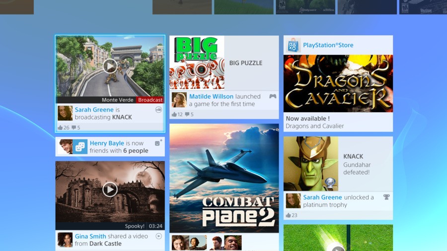
Who left the PlayStation 4 news tap on? As we edge ever closer to the launch of Sony’s next generation system, today seems to be dripping snippets about the impending hardware. The latest tidbit comes courtesy of Gematsu, who managed to get their greedy mitts on a handful of updated user interface images.
The shots aren’t massively different to the ones that we analysed earlier in the year, but definitely seem spruced up. The ‘What’s New’ page, for example, has a much brighter background, as does the video sharing screen. Elsewhere, it seems that you’ll be able to create sub-groups among your friends, as a shot of the ‘Messages’ area shows a separate section called ‘PS4 Lovers’.
Subscribe to Push Square on YouTube166k
New mobile interface images demonstrate how you’ll be able to watch videos, track Trophies, and launch games from your smartphone and tablet. Meanwhile, there’s confirmation of the LiveArea-esque features on the Knack section, as it highlights recently unlocked items and in-game gifts from friends.
The biggest shock, though? Sarah Greene from the recent lifestyle trailer has replaced her blonde locks with a barnet that's a darker shade of brown. In fact, we’re not even sure that that’s the same person. At least you can count on Henry Bayle staying the same.
[source gematsu.com]


Comments 14
I preferred the darker background, not that it doesn't still look gorgeous. The UI is very well thought out and designed, I don't see any reason for people to complain about it, unless they're a Microsheep.
I really like how Sony is taking every complaint about the PS3 and fixing it on the PS4; enhanced DualShock, easy to develop for architecture, easy to navigate UI, strong launch line-up and a strong online infrastructure.
@Lelouch My guess is that you'll probably be able to pick a background colour (like Vita). I personally think that the What's New page looks a bit messy.
I'm not gonna listen to your guys' advice and get really, really excited.
@get2sammyb Yeah, it could look a better. I think it looks a lot better than those hideous Windows tiles, though.
I can't wait to have a faster store and better trophy integration. The loading times on the PS3's store are unacceptable on this day and age.
Henry Bayle is my best mate.
Trophy notifications look to be spoiler city.
Looks decent enough.
So those games, combat plane 2, dragons and cavalier, big puzzle, do you think they are just fake games, or real games with fake names? I think maybe just all fake. Can't wait to see what more exclusives they announce at gamescon
Why is it that every UI designer in the world uses tiles? I don't like these images, they look like facebook or some social network fad not a gaming console menu.
@Lelouch "The UI is very well thought out and designed, I don't see any reason for people to complain about it"
I'd say similar about the XMB, but look at how people flipped out when the extra Store icons were added... let alone the Singstar icon!
@Paranoimia I really like the XMB, it's simple and straightforward. People just love to complain, though, so I'm expecting a lot of whining about the PlayStation Dynamic Menu(?).
@Lelouch Oh, I'm sure some people will moan about something, even if it's just the colour scheme. "It's 2 blu! Mak it green lik xbox!!1!!1!1"
I kinda hope PS4 Livearea will have customize able background.
Show Comments
Leave A Comment
Hold on there, you need to login to post a comment...