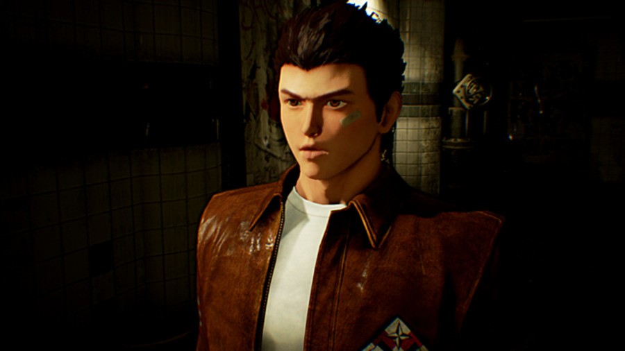
As undeniably excited as everyone at Push Square Towers is for Shenmue III, we've never held particularly high hopes that the game will be any good. But even at this early stage in development, it's looking visually impressive. As part of a Kickstarter update sent to backers, developer Ys Net has shared a few prototype screens – and they're great.
For starters, Ryo Hazuki's model has come on leaps and bounds – and the studio stresses that this is actually an old version. The two battle scenes look great, too – though they're taken from an awkward angle to avoid spoilers. And finally we get a glimpse of a thatched roof house, which again looks decent considering the game's only been in development for three months.
With the story and scenarios locked in, the team's now planning out the game's locations. "Map testing will define the different areas to make sure that they are neither too big nor too small to get to that Goldilocks zone," explained series creator Yu Suzuki. "This consists of looking at the layout of a certain space, and experimenting to make necessary alterations."
The director expanded that if a space feels too open, the studio may choose to reduce its scale – or even increase the number of characters on screen to offer a more populated illusion. "The development team is in high spirits now that we have reached this stage where we are finally able to start testing," Suzuki concluded. Time to get sweaty.
[source kickstarter.com]


Comments 10
it is looking good, now where are the 1 and 2 HD remasters we all want
@FullbringIchigo Up to SEGA innit. If they have any sense: PlayStation Experience.
sometimes when I'm feeling down I just remind myself that Shenmue 3 exists and is actually happening.
Looks pretty good!
@dgdfgdfg Do one
@get2sammyb Since when has bots been posting to this site. The dgdfgdg has been posting to multiple threads.
@get2sammyb IF they had any sense well this is SEGA we're talking about
For 3 months, that doesn't look half bad. Granted, I'm not expecting the game to be a total knockout in the graphics department, but it doesn't need to be.
Then again, we're nowhere close to it's release, so I'll probably eat my hat for that later on.
This is looking a lot better than it did last time. Faith restored
Now that guy actually looks like Ryo.
Leave A Comment
Hold on there, you need to login to post a comment...