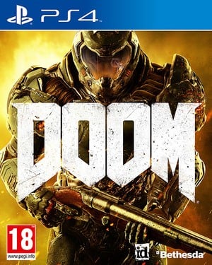
In concept, DOOM couldn't possibly appeal less to this author's tastes. For starters, it's more heavy metal than the doodles on a teenage misfit's pencil case, but it's also one of those games where the shooting's only ever going to be the draw – we're not expecting anything in the way of story at all. Despite that, we're all in agreement here at Push Square that it looks really rather good: fast, brutal, and hard-as-nails.
The thing that doesn't look so good is the game's PlayStation 4 box art, which features an angry space marine standing in front of a p*ss shower. It's about as unimaginative as game covers come, and some smart-witted Twitter users are already taking to social to illustrate their point. But is this the worst video game packaging of 2016? Post something more offensive in the comments section below.


Comments 56
My rebuttal: It's Doom.
That's awful, they need to start again, on that. Look back to Doom and Doom 2. It's a bit worrying, if they rushed out some boring box art, makes me wonder what else they cut corners on in the actual game.
Who cares, I'm not going to be sat watching the bloody game box!
I'll be balls deep in demon guts and blood, wielding that beautiful double barrelled shotgun, during which time, the game box will be sat on the shelf, with all the other game boxes with art that I don't really care about.
It's the game that's important, and its already looking awesome!!!
Is it bad that I don't completely dislike it?Yes, probably.
Game covers are pretty much going downhill these days, so, yeah, at least it's in touch with the times.
It is very generic and doesn't exactly capture the imagination. I still have reservations over the game itself too and think it could be a bit generic as well. Story has become an important part of gaming these days and I am a little concerned that this will be overlooked for just 'action' and as for the MP, that seems quite generic too. Maybe the Box art is apt then...
meh i play the game not the box art, when it's on my shelf i wont see it and when i'm playing the game i wont be looking at it so what does it matter how it looks
at the end of the day the box art is unimportant especially now a days where most games are brought online or even digitaly so they don't really need fancy box arts to catch your eye anymore
@FullbringIchigo The box art in most cases is the same art used for the digital download art on the store. There's a lot of good reasons for putting the effort in, for one, not everyone takes the time to go to sites like these and watch the trailers, etc.
And I thought I had alot of time on my hand's, people actualy care that this box art suck's or that someone took the time to post this on twitter or is it the fact that hundred's of people actualy replied to it that show's how bored some people must be. If people buy game's without watching or at least reading a review then they deserve to buy crap game's.
@xMEADx Says the guy with awesome box art as avatar
Draw David Hayter as the Guyver ON STERIODS WITH A SHOTGUN.
Looks okay to me. Yeah, it's a generic space marine, but it's THE generic space marine.
@fchinaski OOOoooOO someone's feeling brave sat far away behind their moniter, take a quick look at this me little DUCK https://www.pushsquare.com/forums/help_feedback_suggestions/a_quick_reminder_of_the_rules?start=20#reply-25
Without meaning to sound rude... who cares?
Other than identifying it on a shop shelf, how long do you spend looking at it? I pull the case out of my game rack, stick the disc in the console, and put the cover down somewhere. It could be all white with 'DOOM' in plain black Comic Sans for all the attention they get after buying. As long as the name is on the front and the spine, I'd be happy.
Though with that said, I'm unlikely to be buying it anyway.
@xMEADx lol you dont half over react sometimes, i think he was just observing the irony
@kyleforrester87 I don't think it's an over reaction he didn't say anything about the article just a smart ass comment about my avatar and he could only of been hoping i'd react by flaming.
@xMEADx your avatar box art IS pretty awesome though
@xMEADx dude, it was a joke as the guy above said. chill.
@fchinaski fair enough chilled.
@Raymontigue83 I'm with you, I couldn't give a monkeys what a games box art looks like. The box if anything just ends up on a shelf wedged between two other things. I'm sure I'll be able to manage with this supposed atrocity being in my ownership.
I'd do something completely different. Like, for example, an entirely black box with nothing on it. No pictures, no graphics, no nothing. Just black. And then do a huge marketing campaign that the only thing that can save you from impending doom is what's inside the black box.
Just look for the black box. That is what you need.
They should just use this really
@kyleforrester87 Agreed, love that box art.
@jgrangervikings1 they kinda do that with aeroplanes.
My favourite box art has always been the Master System Boxes with the squares background.
Honestly, I like it. DOOM is the epitome of the first-person shooter, so it's only right it should have this type of cover. Could it have been better? Possibly a variation of the classic cover art as an awesome throwback? Sure, but it works for me.
I don't really see the biggie. It's more generic than bad. Then again, maybe it's bad in comparison to other DOOM art, I dunno.
But hey, it's not like we won't know what kind of game it is, since the logo is pretty large. Or is that the issue too?
The name of the game is "Doom", and people are complaining about the box art?
I wonder if this will turn into a Bioshock Infinite situation where they put an alternate cover on the other side.
@BAMozzy
Sometimes the world just needs a big dumb shooter my friend. No 3 minute long cut scenes, no overly used quick time events, no dialogue choices.......just lots of shooting.
As for the box art, who cares, it's Doom.
Who cares?
Who cares about box art!
Get real
I've never played a Doom game but the trailer sort of sold me with how crazy and gory it looked tbh. I'm going to have to check gameplay and everything thing out but can anyone tell me a bit what Doom is about?
@Patinator A portal to hell is accidentally opened on Mars, and all sort of crazy demons get ready to invade. You, a marine need to stop them. That's about it tbh. They might expand on the story a little. They did slightly with Doom 3. But it's more about the game play really. And the iconic enemy design is well worth a mention as well of course.
I'm still really excited by this. I've enjoyed every game in the series so far, and after Wolfenstein I'm really hyped for this.
@Bad-MuthaAdebisi Duke was ok but it never held a candle to Doom. Although on topic, they actually copied the Doom box art for Duke Nukem 3D. Random fact which probably sent you to sleep, haha.
Regardless of the cover, it seems as if they have put a lot of effort in this game. I have a feeling it will be great, in the same vein as the Wolfenstein reboot, and who knows, there may even be a little story thrown in there.
@rjejr Touche.
To me its the FPS version of god of war.
I love great box art this can really encapture my imagination an I appreciate the time and effort put into some art on games I've played over the years this art for the latest doom reboot does not evoke any sense of excitement whatsoever, still I loved doom so I will buy this regardless,crappy,dull box art or not.
couldnt give a flying fruck about the box art as long as the games good
@kyleforrester87
Wait! No! Hold it! That is most definitely not THE generic space marine, we all know there's one Space Marine out there that's even more genericerer!!
@Boerewors
?
@kyleforrester87
Holy mother! I'd buy the kak out of that game!
After Fallout 4 I don't trust Bethesda anymore. My hype for this game is gone and they can rot for all I care.
@AyeHaley It's developed by Id though..
Keep the font and show DOOM like it does now, but make it smaller, MUCH smaller, and make the letters embossed bronze or something. Not that gut-ugly white with letters fit for a billboard.
Don't get all the fuss on box art tbh I don't buy s game if the box looks nice
"which features an angry space marine standing in front of a p*ss shower."
How do we know the marine is angry he could be smiling I can't see his mouth, also can we really not say piss? I never thought of that as a curse really.
It's slightly disappointing to me, but eh, it's just a cover. I agree with whoever said they should just recreate the classic original cover.
Doom guy is not left handed here. That's what's wrong with this box.
kyleforrester87
Agreed. They should stick with the classic colored DOOM logo. Who cares about the nameless guy.
The more I look at it, the more I legitimately like it.
Okay it's meh but it gets the point across, "It's DOOM by id and you get to play as a badass who kills hell-Martians". A callback to classic doom would be cool though. I think the name speaks for itself.
http://static.giantbomb.com/uploads/original/9/93770/2365608-3do_doom.jpg
Model it after this. We need more 90s cover art.
Sorry dudes i like it.
Yeah it's pretty generic and I like box art to look nice and all but to me the fact that it says Doom on it is enough for me to know I will be getting it and the game looks fun, mindless fun
Leave A Comment
Hold on there, you need to login to post a comment...