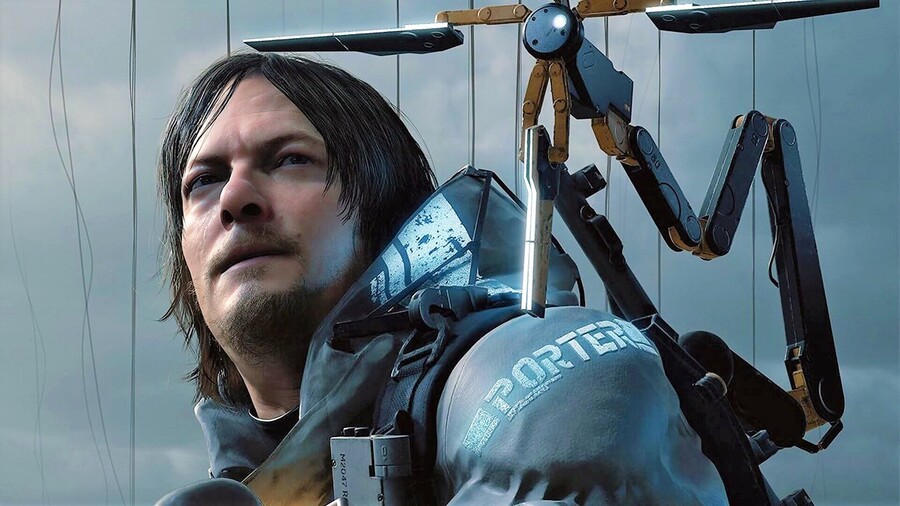
Death Stranding's official box art was revealed just over a week ago, but it wasn't to everyone's taste. The cover, which features main character Sam off to the side, looking back across the box, divides opinion, with many saying it's just a bit boring, especially for a inevitably mental game like Death Stranding. For the record, we think it's alright, but we did expect something a little more... Abstract, or dramatic.

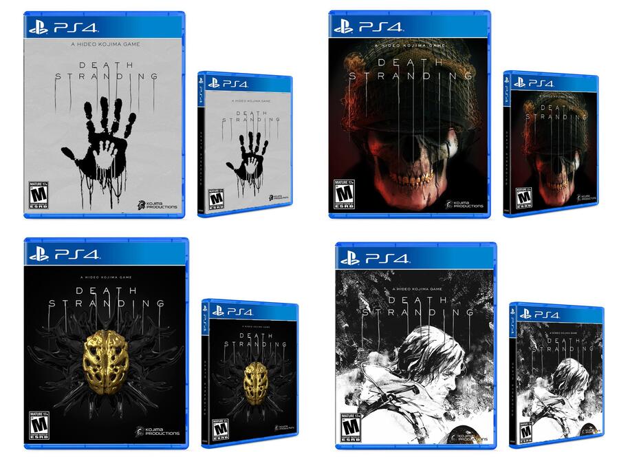
Step up Reddit user Frocharocha, who's created four alternate box arts for Kojima's latest -- and we think they're superb. We love the minimal design of the top left cover, while the bottom right is really eye catching. The other two are especially ominous, and to be honest, we'd be more than happy to see any of them sitting on our shelf.
Which alternate cover do you like best? Would you replace the official box art with one of these, given the choice? Become an art critic in the comments section below.
[source reddit.com]


Comments 16
I like the last one, reminds of something Ito would draw. But again a boxart has to sell the game in a split second and sadly any games with abstract artwork just doesn't work.
Considering how scathing Push Square normally are of generic box art I'm quite surprised that they think the official one looks alright; it's just so boring! All four of those are wonderful!
I like the grey one with the handprints. Way better than official box art imo
First one reminds me of Infamous Second Son
Omg, love the black & white one. That is a proper work of art, I would be proud to display that on my fire place.
I like the first one, with the handprints. It's really good design, simple but effective.
Gotta say I like the one that looks like a pencil sketch (4th one).
Getting a Metal Gear vibe from it.
The top left one is a straight rip off of infamous second son lol
I like the bottom left one. The contrasting gold thingy in the middle is striking, even if it doesn’t say much about what the game is — which actually fits for this mysterious game. The upper right one looks like it’s for a game that’s a zombie shooter.
All of them are better than the official design (in my opinion).
For a game that’s is so unique and powerfully cinematic it is a shame they made such a bland official box art.
The rendering doesn’t even look right, it looks low res (on his face and around the eyes) and is actually off-putting. I’m still going to buy the game but might choose digital or the special edition over the original, it is that bad for me.
Bottom right. Sketchy art, previous MGSs cover art, Rockstar cover arts or anything that looks like a drawing or celshaded is always good-looking.
I don't think the skull one doesn't really suits the game, but it looks awesome.
I think it is so easy for us to make an alternative cover using some element we saw in a trailer. But the truth is that maybe the appeal of the cover becomes apparent after playing the game.
The last one by far.
The last one looks like kenzo tenma sensei from monster
The one with the skull soldier and the BT monster are probably very misleading for box arts, as we don't even know how much of a role they have in the story or the game. The handprint isn't bad but I honestly prefer the official box art over it.
the fourth one looks okay and to be honest I still take the official cover over that. I have full trust in Kojima-san and what he does and I'm sure he's done the right thing, he might have his own personal reasons.
Interestingly, idk why Death Stranding's box art is even a subject of discussion since its reveal. Sometimes I just think whatever Kojima touches, people start to suddenly hate it at first and then realize that it was good.
Leave A Comment
Hold on there, you need to login to post a comment...