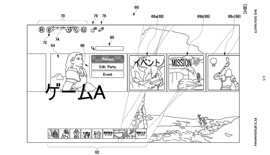
Excuse the crude patent diagrams, but this could very well be our first glimpse at the PlayStation 5’s user interface. Sony bigwig Jim Ryan has promised that all will be revealed soon, but this documentation submitted by the platform holder potentially reveals some of the things we can expect to experience when we boot up our next-gen console for the first time.
What you’re seeing in the diagram is a game that’s been selected from the main menu. This brings up a ribbon of icons, some of which are personalised and tailored to your individual progress. The first panel boots a quick menu, which allows you to do rudimentary things like restart the game or create a party to play with friends.
It’s the other panels that are interesting, though: these can be contextual, so if you’ve just beaten Mission 4 in a particular game, it’ll show you a panel for Mission 5 – allowing you to learn more about it and jump directly to it. You’ll also be able to view which of your friends have played that part of the game, and any other additional information pertaining to their progress.
At the top of the screen is your friends list, but you’ll able to spotlight particular pals, and you’ll get more information about what they’re up to – for example, if they’ve started a livestream. A lot of this social stuff aligns with rumours we’ve heard about the PS5 UI before, so hopefully the Japanese giant will pull back the curtain soon and share more with us.
[source freepatentsonline.com, via resetera.com]


Comments 28
Hope we'll get a glimpse soon... it's kinda awkward to some of us that already made a preorder of the system and not have seen the UI and other details of the hardware...
Not too bad, and it's basically an improved PS4 menu.
Can't wait for the official announcement of "GameA". Also nice cameo from the Gamecube logo.
@Matroska
That's actually the Guerrilla Game logo, but the similarities are striking. Never noticed that before 😂
@Matroska That's the Guerrilla Games logo - lol!
Looks close, though!
Hzd with co op? Pure speculation, but would be awesome.
@GamingFan4Lyf @normanself It's a bit weird they're clearly using the next Horizon as an example game yet refer to it as ゲームA in the pic (GameA) as if it's some generic made-up example. Presumably the implication is that there'll be a GameB, GameC etc and the whole UI will change based on that. They already have a more basic version on PS4 when you press down while selecting a game and the music and background changes.
I don't think I want to see the UI before I power it up this time. Save something for Christmas morning.
@Matroska I love that feature - I wish the background and music changed automatically when hovering over a game instead of pressing down - the PS3 did that!
Umm HZD2 multiplayer confirmed?!
Seems like Sony has been copying Nintendo's homework again if this is legit haha.
@strawhatcrew hope not...
What I want from a user interface is whether I can see which game I am selecting. I don't need bells or whistles. I want to select a game and start playing. What else could an almost all single player gamer want?
I hope that it is neat and slick. I don't need a hundred features that most of us will never use
To this day I think the PS3 menu was pretty much perfect. A few updated features about online friends and chatting would have been good enough for me.
@djlard - I agree. I don't want any multiplayer anything in HZD. just something I noticed and I'm surprised wasn't brought up. But hey, it's just a mock up so it can mean something or totally nothing at all.
I hope it will be FAST and ALWAYS be FAST!!! It seems every Gen consoles get slower(the UI)(well PS3 and PS4 Gen's) Once you add loads onto your hard drive.
@AJDarkstar think it can be turned off. Think they plan on having a very customisable UI this time around.
@strawhatcrew I could see a multi-player mode being potentially fun. A couple of character classes, Tracker, Trapper, Hunter, Healer and set players off Monster Hunter style into the world to track down legendary beasties. Wouldn't need to be part of the main game, but as an add-on to the product and another way to engage with the world / assets I could see them generating something worthwhile and fun for those who wanted to try it. Even release it as an update later on like Ghost of Tsushima is doing.
I’m hoping that isn’t the UI. Looks messy. Might be supremely functional of course but...
Plus, no symbol for trophies as far as I can see. Which, disappointingly, would indicate Sony’s disinterest in them continues.
Not going to jump to conclusions though, this looks to be a game specific screen so maybe there is a dedicated trophy section elsewhere
@KippDynamite I hated the interface for PS3, found it unintuitive. The PS4 UI is flawed for sure though.
@Old-Red how so?
@Enigk obviously that's the minimum you'll get.
@theMEGAniggle That UI is almost identical to the switch UI. No?
They will, this is Sony's style but I got used with it, so I wait patiently news from them. 😉
@Old-Red it's identical to the PS4
@theMEGAniggle Then I will be a happy man when I eventually get one.
As long as its smooth and fast at loading up games , store , friends list and other menus then ill be a happy gamer.
Leave A Comment
Hold on there, you need to login to post a comment...