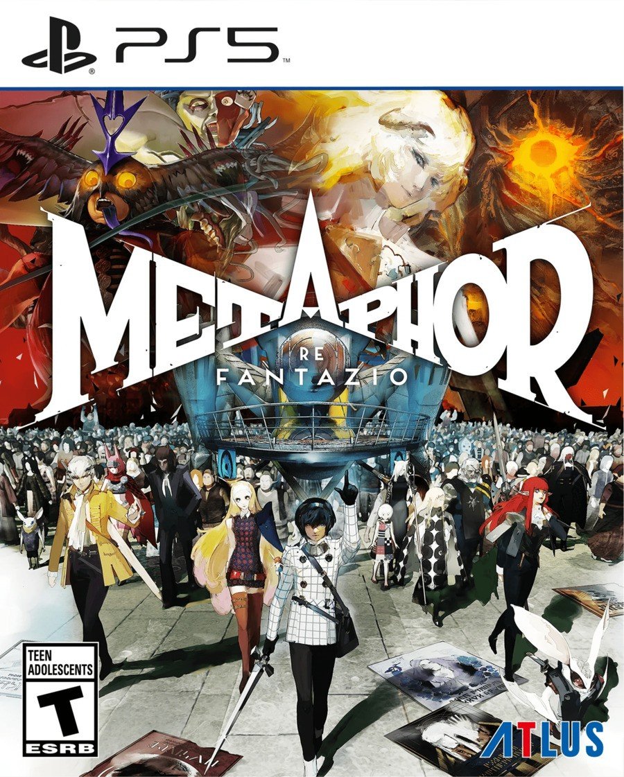
There's nothing quite like video game box art that makes you stop and say "wow". Admittedly, it's been a while since such a cover caught our eye, but we simply can't gawk at the newly revealed box art for Metaphor: ReFantazio and not write an article about it.
The upcoming RPG looks to be a stunner in terms of art direction, and the cover gives you a taste of that before you even get started. It features gorgeous character-focused art, and although we still think the name 'Metaphor: ReFantazio' is a bit... overwrought, we can't argue with the logo, which is striking.
NieR: Automata's Kazuma Koda is credited as Metaphor's concept artist, so we're assuming it's his work that's decorating this box, but it's also worth noting that longtime Persona character designer Shigenori Soejima is running the show.

Are you as taken with Metaphor's box art as we are? Have a quick say in our poll and then make some room on your shelf in the comments section below.
What do you think of Metaphor: ReFantazio's box art? (529 votes)
- Stunning
- Very nice
- It's okay
- Overrated
- Rubbish


Comments 20
It's very nice. As ever Atlus is on point with their graphic design. But saying you are in "awe" of it seems like typical internet hyperbole.
Not "Metaphwoar"?
I'm in awe over everything about this game! Keeping tabs on it. Never really saw P5's UI as extra stylish but this right here is the real deal, everything looks stunning!
I like it. One of the best game art I've ever seen imo is the mural from fire emblem engage, which is odd because the rest of the game looks like cheap anime with toothpaste stains.
@Shaunholio I've missed an absolute sitter here.
Average soulless Disney/ Marvel cover.
This looks almost tongue in cheek though
Not a Jrpg fan since the PS1 days but P5R got me hooked and this looks even better. Day 1
Wonder if they'll go the same route as Unicorn Overlord and skip the PS4 physical version... Hopefully not.
Like usual, when it comes to style, Atlus knocks it out of the park. Will definitely be playing this come October!
@breakneck I think it captures the scale they're going for with the game very well. it doesn't always have to be simple if you're trying to embody something massive
It is truly beautiful. Oktober 11th can’t come quick enough.
I like how the title looks like it was slashed into place by a sword. The angular font adds so much depth and dimension to the piece, while the overtly symmetrical composition communicates a sense of power and control: you have the means to keep chaos at bay. It’s fantastic box art.
Removed - unconstructive
It does looks really good.word up son
@Foxhound Its already listed as coming to PS4
@Foxhound unfortunately, i believe they are skipping ps4 physical editions in the west. we again have no choice but to import the asian (multi-language) version from play asia at a much higher cost if we desire a physical copy (if there is one. currently, there is no multi-language option available for pre-order). strangely enough, the asian (multi-language) ps4 physical of unicorn overlord isn't even in stock on play asia — not sure if it is permanently sold out or what.
https://www.play-asia.com/unicorn-overlord-multi-language/13/70gs15
Why is the main character wearing a Master System box?
Looks amazing, the box art for Shin Megami Tensei V Vengeance looks amazing as well.
Atlus does make some very nice box art for their games
This is indeed an absolute looker. That's one thing Atlus always just does right
@kyleforrester87 It's a Sega game. Why wouldn't he be?
Leave A Comment
Hold on there, you need to login to post a comment...