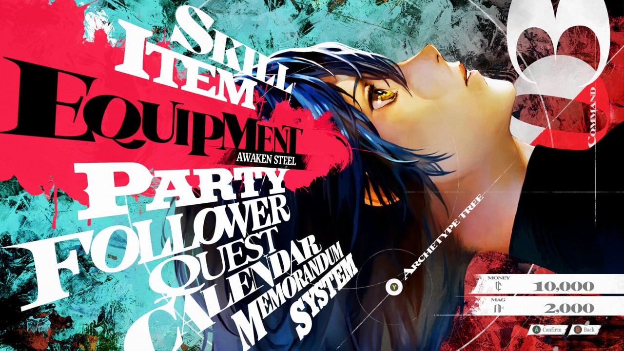
Astonishingly stylish, Atlus is currently the reigning champion in UI design, with its legendary Persona series scoring full marks in this regard. The imminent Metaphor: ReFantazio is no slouch in this department, either, and Studio Zero director Katsura Hashino was recently asked about its gorgeous menu design, and you can almost hear him audibly sigh.
Speaking to The Verge, Hashino says it's a relatively straightforward process, but it takes excessive work and time. The secret, he says, is that each separate menu page gets its unique design and must always remain simple, practical and usable: "This is actually really annoying to do. We have separate programs running for each of them as well. Whether it’s the shop menu or the main menu, when you open them up, there’s a whole separate program running and a separate design that goes into making it. It takes a lot of time."
Elaborating, the director says the studio benefits from "the know-how that we built up over the years" but admits that a lot of work goes into refining the designs. As an example, Hashino says the angular elements of Persona 5's menus were causing issues with legibility and were "impossible to read at first".
Are you looking forward to Metaphor: ReFantazio? Are you a fan of cutting-edge UI design? Let us know in the comments section below.
[source theverge.com]


Comments 14
So one of the reason why the game took 8 years to finished is because they're busy making the stylish UI 😆
N00b developer, just slap on that default Unreal Engine menu and call it good. Extra points for Comic Sans font. 👨🍳👌
I prefer the clean UI of a Dragon Quest Game but to each his own^^
I'm not playing this game until there's an option to make this whole menu appear in the comic sans font.
I appreciate the work they put into them then cause you spend a lot of time going thru menus in jrpgs. I always took the time to stare in awe at P5 menus
It's especially cool, in an age where a lot of games seem to want to streamline them to the point they come off as bland and boring. Mostly from western games and some Ninty games like botw/totk and Mario odyssey, I've notice
Persona 5's menu UI is my second most favorite UI. The amount of work put into it is so damn good. Most favorite still gotta go to Dead Space though, the pure genius of having the UI be part of your character and be part of the world too is amazing.
I can see why they can be annoying to create. The UI is one of Persona's strong points and I appreciate the designers for making them. I am looking forward to Metaphor since I pre-ordered it a few months ago and the last new game of 2024 I'm playing.
Atlus does UI menus like no one else. I don’t think anyone does it better than them.
Menu's are a work of art. The bland dungeons not so much. But you can't have it all.
They are on a league of their own in this! But I always liked this in Japanese RPGs, the UI is part of the overall aesthetic experience.
Metaphor is also good with quality of life touches, almost everything is accessible in one button press.
That said, the demo is kind of an eyesore with PS3 assets and Switch AA: my husband came back to me playing this and was like “is this out on Switch?” “Nah, this is the Ps5 version”. We tried the PC version and it’s even worse. It kinda feels like a remaster of an old game.
They are the only developer that I can say I look forward to how the menus look in their games. I'm sure it does take a lot of work but boy oh boy does it pay off. Metaphor is no different from what I've played of the demo.
I feel this Metaphor is the most stylish, P5's UI was a bit simple for me.
Man games are so generic in their core design nowadays, let alone their menus and meanwhile you have Atlus...
This alone could persuade me to pull the trigger lol, I care for these details and they should really be supported!
I'm really not liking what they did.
The font and colours hugely decrease legibility and the "cool" glitch effects are a distraction.
Leave A Comment
Hold on there, you need to login to post a comment...