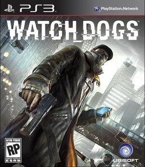
For all of Watch_Dogs’ promise of innovation, we’d have thought that the designers at Ubisoft would have managed to come up with a more interesting cover for the release. Alas, here’s a picture of protagonist Aiden Pearce pointing his gun at the title’s ESRB rating. Perhaps the character’s not happy with the enormous logo covering up the right side of his rather fetching trench coat.
The French publisher has only revealed the PlayStation 3 cover for the time being, as we still don’t know what PlayStation 4 boxes will look like. Considering the similarities between the PS3 and Vita’s layouts, we’re expecting something similar for Sony’s next generation machine. How would you like PS4 packshots to look? Let us know in the comments section below.
[source facebook.com]


Comments 9
It would be interesting to have the logo run along the side of the cover instead of the top.
Ehhhh I expected better. Something a little more edgy perhaps.
It would sell more if they put the orange on it like all the battlefield and mass effect games. So boring
I kind of like how the "Hacking" effects of the phone are displayed on the box. Subtle, but present.
I like it. I hope the PS4 boxes are the same shape with different logos. My stack of games needs to be even!
Don't care. Just want the game.
I really don't like the Watch Dogs pack shot. Why have a huge gun in the foreground? It's so tacky and predictable.
i think PS4 box arts will look like Vita box arts just bigger you know like this

but with PS4 on the top
on to Watch_dogs box art it's kinda bland a generic but then again i don't really look at the box's because it's what's inside that more important
Look at the Persona 4 Golden pack shot @Majin-Naruto posted. Then look at the Watch_Dogs pack shot. It looks so incredibly bland and boring.
Leave A Comment
Hold on there, you need to login to post a comment...