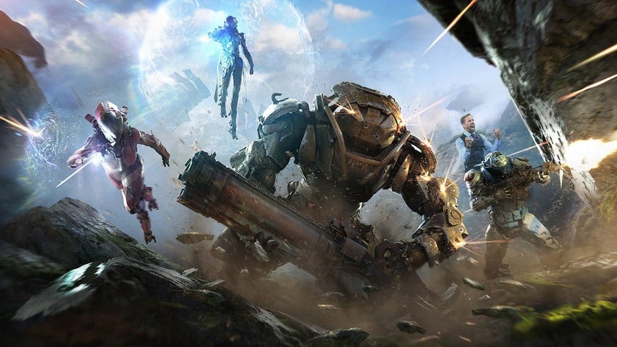
Is this the official term now? Damage floaties? Hmm, it works, we suppose. So yes, there’s been some criticism of ANTHEM’s number indicators, which pour off enemies when you fill them with lead. But the good news is that BioWare is making them totally customisable: you can turn them off entirely, you can make them smaller (or, we assume, bigger?), and you can even change their opacity.
Personally we’re rather fond of ol’ damage floaties, but we know not everyone’s a fan, so providing plenty of options is never a bad thing. Will you be keeping the numbers enabled – or turning them off entirely? Land a critical hit in the comments section below.
[source twitter.com]


Comments 21
Wow, that makes all the difference. I've gone from "couldn't care less" to "must buy!" </sarcasm>
@Paranoimia Right?
I love the damage floaties.600.600.6000.it looks amazing.im keeping it on.vive la france mon ami.merci.word up son
When I hear "floaties" I'm thinking of something else.
@adf86 Yeah, Anthem.
Actually how bioware works with the community has been really great. That they solved this tells us they are listening to the community.
I think there is a place for them but I did think they were a bit too much in the original demo's. It appears though that they are on the largest (100% size) and solid too (100% opacity). I think I would reduce the size and make them more 'see-through' when I buy this.
I know for some, they find these numbers to be somewhat distracting or even take you out of the immersion. Its been a topic of discussion for Day's Gone too recently. I think it makes much more sense though to give players the choice, the option to turn them on/off at the very least. However, I do think that the option to change the size and opacity is a fantastic addition to the options and something other games should also think about offering....
I would probably keep them on to help compare weapon damage etc. I am looking forward to this game. Looks pretty good and Bioware are making all the right noises. EA's recent gorging on humble pie will also help I'm sure.
The default is far too big. You can barely tell what's actually being shot.
@get2sammyb I wonder what Armour and weaponry the Gareth Southgate Mech has in the picture ?
I like my damage floaties, so I’ll keep them if I play the game. Gosh dang though, I’m not sure what will be better: the game or the term they just came up with.
@adf86 sounds like you need more fibre in your diet
Haha. I'm loving these little sneaky Southgates in the article pics.
Least this ain't a day 1 patch or could it be (cue drum roll).............da da daaaaaaaa
Anthem looks like the perfect mixture of Destiny and Monster Hunter World for me, looks like solid fun even though it's far from unique in any way (apart from perhaps the verticality and scale in the maps).
Gamers will complain about anything.
People must not have played much WoW or any MMO to complain about dmg numbers in the HUD. I'm with @Splat, gamers will complain about anything... or I'm more along the lines of twittrolls just like making noise per usual. But I like the customization of any HUD. Need more games that have that.
I like that they are giving players choice. I will keep them on to see what guns do what kind of damage and then turn them off if I want full immersion. Sometimes it's the little things lol
Thank goodness. I can't stand these, for whatever reason.
@starhops WoW and other MMOs have a different perspective though and the whole play style is different, where aiming is not needed. Also, WoW does have the ability to modify the look of damage numbers or pretty much anything through mods.
Now in a shooter, where accuracy is important, if some damage numbers are blocking your view, its just stupid. Most shooters deal very well with damage numbers (e.g. Destiny). Its strange that Anthem does such a bad job at them. It appears that Mark Darrah himself was even kind of annoyed by them. I have no trouble with the white indicators, but the yellow ones are just too much in-your-face and should be reduced in size.
@tatsumi Aiming is needed in WoW, just differently is all. And as I mentioned, I think all games would do better to add more customization of their HUDs. I think GoW could've used a better customization of it's HUD.
Yeah, I agree that large fonts blocking views is silly. I'm glad they are changing it. Sheesh, just a scroll tally on the side works, right?
Leave A Comment
Hold on there, you need to login to post a comment...