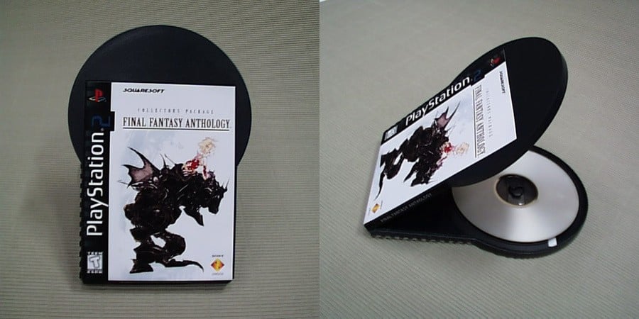
PlayStation games have always come in pretty ordinary boxes. The PS1 had its CD-like jewel cases, the PS2 kept things standard with a DVD box, PS3 shrunk things a little to match standard Blu-Ray releases, and it's been roughly the same since. Aside from its handheld machines, Sony's consoles have stuck to pretty regular game cases — but with PS2, the platform holder nearly went in a very different direction.
A new article has highlighted designer Hock Wah Yeo and his outlandish packaging creations. Towards the end of the feature is a segment about a never-before-seen concept for PS2 game boxes, and it's mad. Apparently, Sony approached him in the late 90s to design a brand new case for its upcoming console, and true to his style, he came up with this:

Highly impractical but brilliantly weird, this was nearly what PS2 game boxes would look like. The cover art is pretty small when you compare to the size of the disc, and it's hinged on the bottom, so you'd be viewing the artwork sideways as you open it. The prototype looks cool, but this would've been an absolute nightmare to store neatly at home or in a shop, so it's no real surprise that Sony Japan stepped in and cancelled the project. In the end, of course, we got standard DVD boxes, but we could've had these obscurely shaped cases to contend with in the early 2000s.
It's a fascinating little story, but we feel like Sony made the right call in the end. What do you think of Hock Wah Yeo's unusual PS2 game box design? Discuss in the comments section below.
[source obscuritory.com, via kotaku.com]


Comments 29
I find this design both oddly satisfying and very frustrating.
Oof. Glad they didn't go with that. It looks like snapping the disc inside would be incredibly easy with that design.
Opening it from the top of the artwork instead of the side would frustrate me more than anything else.
The Franken-case. Love it/hate it/can't decide.
Would have cut down on plastic, looks smart.
PLASTIC NINJA APPROVED
Oh wow, that’s weird. I appreciate the sheer oddness of it but yeah, it would have been a nightmare.
Cool design, but unless you stack them there's no way you could get it organized lol
Not gonna lie.. im haing mixed thoughts about this..one side says this is really cool and the other is saying its stupid .
Either way , I like it ; maybe its just the inner-child in me or how big of a sucker i am for (abstract) designs instead of just the simple standards of things . Like , I still want the PS3 boomerang controller , and the N64 controller is still one of my most favorite controllers ever despite how unintuitive it can be .
overall , i dig it.
If you try buying a good condition PS One came on eBay it is a lottery whether it will arrive unscathed. Those cases were so flimsy, it’s hard to come by one that isn’t cracked or broken.
I like it but would have been better in the blue colour.
I would have thought PS5 game cases could be smaller now due to no manuals and to cut down on plastic use which is very popular these days. They only need to be as high as normal CD cases. Assuming it's not that Sony don't care but that it is cheaper to use existing designs.
Functional or funktional - the ever raging war in a designer’s head.
Given the hinge issues with the ps1 cases, these things would have been a design nightmare. So many would get broken. Wise to ditch this in favour of DVD cases. That said, this is the kind of wackiness i love about Sony that is largely missing these days
I don't know, it could have been fun to put two of them side by side under the sofa and pretend you'd crushed Mickey Mouse
Given that the PS2 basically set the high bar for all consoles, I think Sony made the right choices for that era.
A storage nightmare.
That would look great on the shelf next to my Simpsons Season 6 shaped like Homer's head and my Blade Runner Collector's Edition shaped like a briefcase.
Looks like a larger version of the PSP's UMD casing.
I guess all that design work wasn't for nothing, right?
“It's a fascinating little story, but we STRONGLY feel like Sony made the right call in the end.”
Atrocity. Pure chaos.
I don't like that case.
It disturbs me.
This is on PS3 boomerang controller levels of "Thank Christ this didn't happen."
It's hard to look back and think of anything but the current DVD case styles that were adopted. This looks weird.
I once checked the definition of fugly and it was this.
Say this 5 times real fast: Bring back black backed discs!
I still want them to shrink down the PS5 game cases to PS1 size and this was ugly.
Looks mad goofy. A lot of ways that idea could have been done better.
That’s abysmal.
I wouldn't say they look I any way weird!
@Gremio108 What did Mickey Mouse ever do to you? D:
Leave A Comment
Hold on there, you need to login to post a comment...