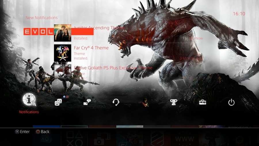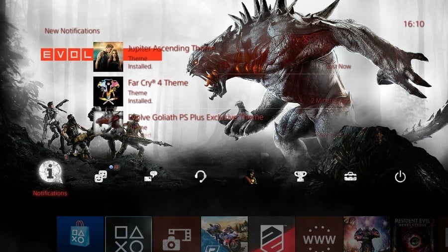
PlayStation 4 themes are all well and good, but sometimes they favour style over substance. This often renders the user interface's text difficult to read, but fortunately with PS4 firmware update v2.50, you can add a drop shadow to make it stand out a little more. Here's what you need to do.
1. Go to Settings
From the PS4's home screen, hit up on the DualShock 4 to reach the top layer of the system's menu, and scroll to the toolbox labelled 'Settings'. Select it with X on the controller.
2. Enter the Themes submenu
When the long list of options appears, scroll down until you reach an option named 'Themes', and select it.
3. Turn on Text Drop Shadows
In this area, you'll find an option labelled 'Text Drop Shadow'. Select it, and a sidebar will appear on the right-hand side of the screen. You'll have three options here: 'Standard', 'White', and 'Black'. Selecting 'Standard' will turn off the drop shadows, while 'White' and 'Black' will enable drop shadows of the respective colour. Simply click on the option that you want.


Comments 3
Oh thank God.
I turned the Bold function on instead, I think it looks better in bold
With describe of these tips on here you did very good work from learners can get useful info about editing of text. Don’t waste your time n fake writers and get help from https://www.rush-my-essay.com/our-services/dissertation/ here for your valuable works.
Leave A Comment
Hold on there, you need to login to post a comment...