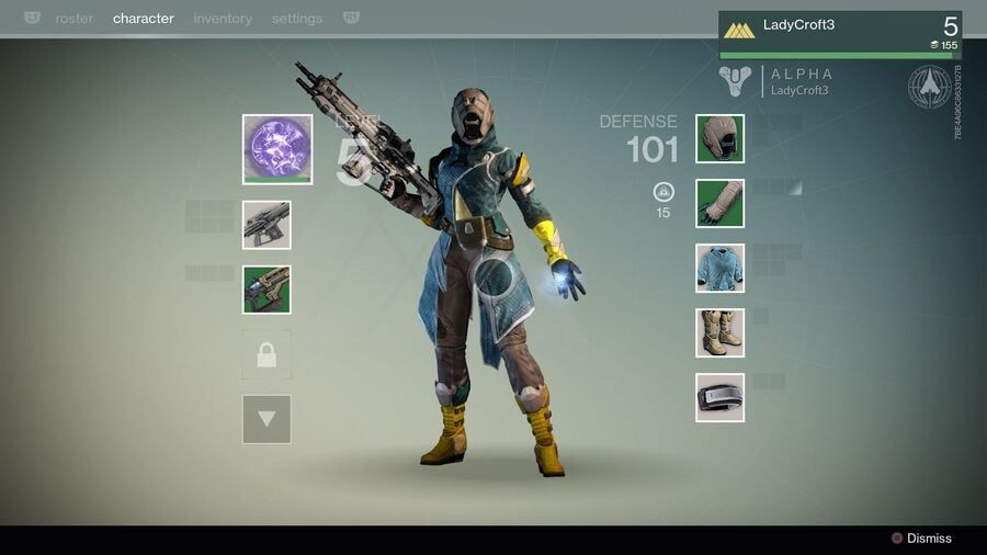
I tolerated the cursors in Theme Park and Theme Hospital on the PSone because even as a nipper I knew that these games had been ported from the PC and there was really no other way deliver them on Sony’s grey device. The Horde, too – one of my absolute all-time favourites on the ill-fated Panasonic 3DO – had simulation sections that simply wouldn’t work without a cursor. No problem. But we’ve got to talk about this new trend of every goddamn game post-Destiny laying out its menus like they’re meant for a mouse. What the heck happened to console optimisation?
I’ve no problem with what Destiny did: the user interface is probably my favourite part of that series. But it seems like game developers liked it a little too much, and they’ve all been scrambling to add the exact same feature to their titles – often where a simple push of the d-pad would suffice. Let’s have a look at a handful of examples.
Subscribe to Push Square on YouTube166k
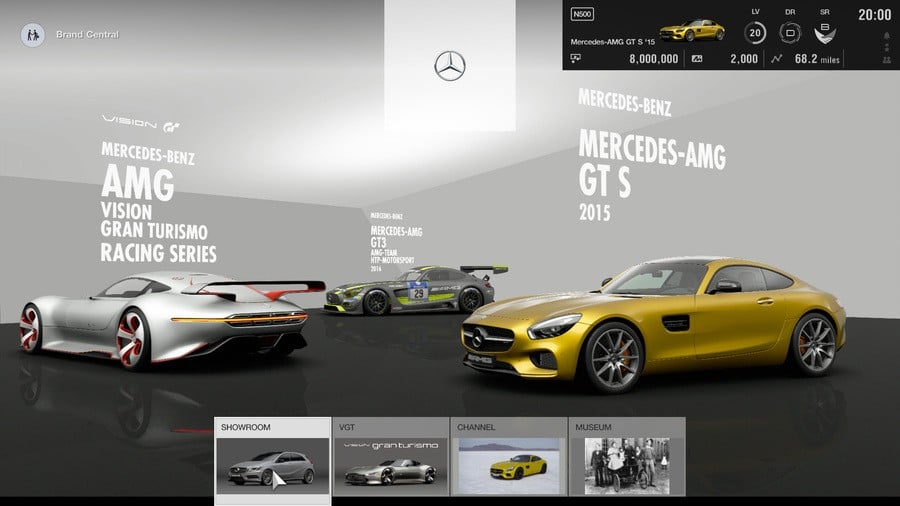
First up we’ve got Gran Turismo Sport, a racer that likes to think of itself as less of a game and more a high-class piece of software. I actually think the UI for Polyphony Digital’s online-focused driving simulation is a thing of beauty, and its cursor works in tandem with the d-pad to make a webpage-like browsing experience. This isn’t the worst example given the complicated nature of the game, but it’s all downhill from here.
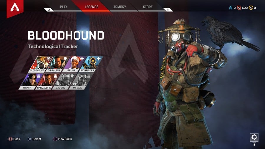
So here is Apex Legends, a game which has a cursor for literally no reason whatsoever. Many of the menus can be navigated using the d-pad, but sometimes it’ll just demand you move the analogue stick around like it’s a bleeding mouse. I find it most infuriating during the character select screen, as in order to navigate to your chosen Legend, you need to hover over everyone – prompting the preview animations to momentarily freak out. It doesn’t need to be this way!
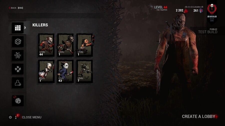
Then we’ve got Dead by Daylight, an asymmetrical competitive horror game starring Freddy Krueger. But the most frightening thing here is not LeatherFace or his associates, but the fact that its menus inexplicably need to be navigated with a cursor! Why? This isn’t Microsoft bloody Excel!
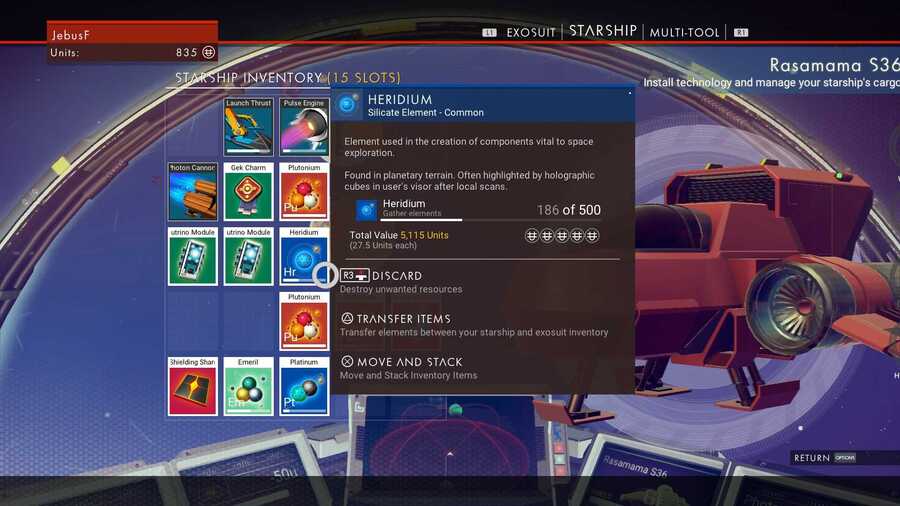
Ahhh, good ol’ No Man’s Sky – the indie game that was sold at full-price and temporarily made the gaming industry lose its collective mind while Sean Murray and his team dug in and really delivered in time. It also had the goddamn cursor thing, making navigating its already obnoxious menus many times worse.
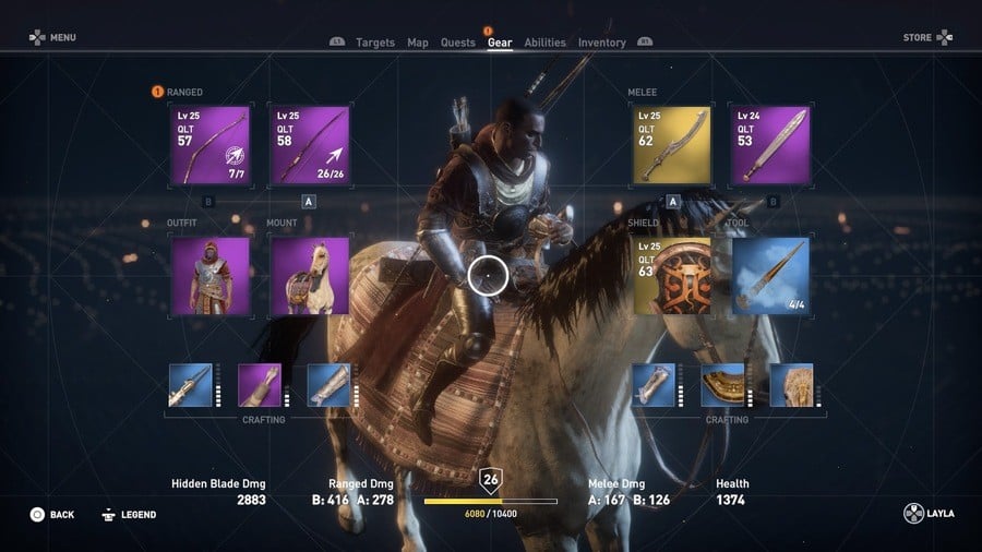
Assassin’s Creed loves to follow a trend, so of course it’s got a cursor now. Does it need one? Does it bloody ‘eck? What’s wrong with using the d-pad to browse your inventory? Oh yeah, nothing – get in the Egyptian sea.
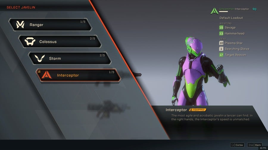
And we could go on for hours here, but ANTHEM wasn’t going to be a true Destiny knock-off without a bleeding cursor, was it? Except, as with much of the game, it’s a cheap imitation, with the UI obstructed by irritating tooltips and fiddly shapes. Rubbish!
Look, there’s no excuse anymore, and I for one have had enough: it’s time to kill the cursor in console games. I’ll let Destiny off the hook – developer Bungie did a good job there. And I’ll also allow it in certain types of titles, like Cities: Skylines. Everywhere else, though? No. Consoles have analogue sticks and d-pads, not a mouse and keyboard. Somewhere along the line the industry forgot that it’s making games for a DualShock 4 when it releases on the PS4, so hopefully someone is paying attention and this is the wake-up call they need.
Have you got console cursor blues? Do you agree that this menace needs to be eradicated ASAP? Drag that pointer over the screen and hold the X button until something happens in the comments section below.


Comments 26
A true curse on video games.
It doesn't bother me in the slightest. Its just as easy to move a cursor with an analogue stick as it is to move it with a mouse. In some cases, its actually quicker and better than a D-Pad. An example could be selecting your character in a fighting game where you have to use a D-Pad to move a 'highlight' left/right up/down until its over the character you want - its much quicker to move a cursor over the character and select that way.
Its easier to move directly to the skill you want to spend a skill point on in those 'web' type upgrade screens than to move a highlight cursor around.
I guess the 'perfect' situation would be to use both options so those that can't cope with a cursor can use a D-Pad and those that want to use a cursor for speed and efficiency can do it that way too if they want.
The issue is not the cursors, the issue is UIs being absolute garbage - like Anthem's.
Destiny has a clean and easy to navigate UI, the cursor works just fine for example, its when you put a metric tonne of clickables in weird and wonderful places that you make it all extremelly awkward.
I'm not bothered with cursors tbh. It was used brilliantly in Destiny, but then that was a well designed UI in general. I tell you what UI that NEEDS to go away, the faux AR menus. The Division is the best/worst example of this because everything is at an angle it makes it more awkward to read then it should be, the fact they didn't change it for 2 is baffling.
It's almost like the games were initially developed on PC, before being ported to console dev' kits.
Doesn't bother me that much
But using the the d pad to go those 4 directions is sometimes better.
@RogerRoger
Itsmostinfuriating meme
Lol, what a weird thing to complain about. Never had an issue with this before
I think we have bigger issues such as over priced unfinished games, micro trans, and dlc. Seems like a meaningless complaint.
"Panasonic 3DO" wow at the time i thought it was the future.
Curse you Sony.
Better not play Smash.
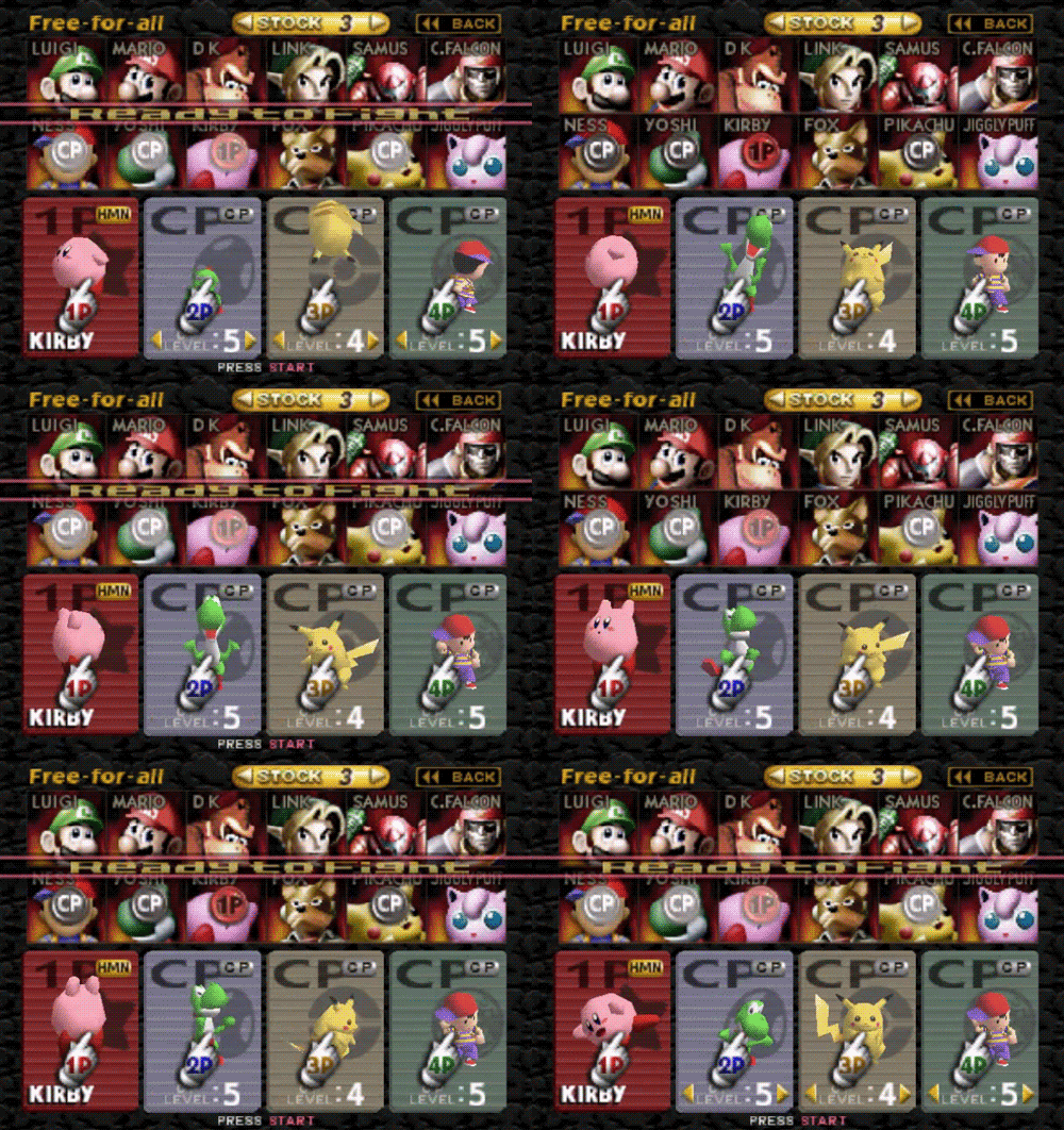
Besides Smash I don't think I play an curosr games too often, but when I do come across them they always seem stupid.
Youve got a touchpad. Use it
If they're going to insist on a cursor, at least make use of the PS4's built-in ability to use a mouse and keyboard.
@ZAKtheRIPPER Hence "Soapbox". And folk can think of more than one thing at a time.
I find cursors moronic and a tad pitiful. Be what you are. Reminds me of Mike Martz. Not that Mr. Martz is pitiful. Just an analogy. Well, not that Mr. Martz himself is an analogy. Okay, I guess he might be an analogy in a given context, but I don't know what that context would be. Certainly not here. At least, not as far as I can see. Now I'm gonna have a sandwich.
I completely agree. It’s a pain in the backside. And it’s made even worse when they couple it with the need to hold the select button to select things. Why?!
They are annoying, especially when they feel too slow/ fast, so you feel like you're waiting for it to follow you or they shoot off the edge of the screen and you're wondering where the heck it went haha
Only time i like them is with motion-controlled games, they feel natural then, they make sense for those games and are great in VR, otherwise, they need to feck off lol
You need to try to get some traction on Twitter with this article.
I knew there was a reason I didn’t like No Man’s Sky, I just couldn’t put my finger on it. 😉
Shame they can't give you a choice really, surely it wouldn't be too much of a hardware overhead to have both options.
As mentioned above though, does the touchpad work to move the cursors around in the mentioned games? You know it never occurred to me to try it, I'll give it a go when I load up Odyssey later!
Analogue stock for the cursor, d-pad to navigate normally. Why not have both!
Worst offender for me is Warframe. They forced the cursor onto console players last year and it is abysmal. Everything about it is clunky and unintuitive, which in a game where a lot of time is spent in menus to mod weapons, frames etc is inexcusable. It's the main reason I don't play the game as often as I once did.
I can kinda understand games made on a budget and made for pc and consoles, but games like the first Destiny which never came out on PC? There is really no excuse. They really are horrible to use in the games I've played that have em.
Great article. So much rage
Just roll with it
Exactly dude, it stinks of copycat UI design
Show Comments
Leave A Comment
Hold on there, you need to login to post a comment...