As console feature sets grow in complexity, quality interfaces are becoming increasingly important. While the PlayStation 4’s promise of a socially connected device may sound tantalising, its biggest challenge will be communicating all of that information in a cohesive manner. During last week’s PlayStation Meeting press conference, Sony briefly described how it intends to expand its next generation platform’s frontend in order to accommodate new features such as video broadcasting and more, but it failed to delve into specifics. However, a new batch of high-resolution screenshots released by the manufacturer overnight has given us our first glimpse at how the impending system’s new functionality will work. So, without further ado, let’s take a deeper look.
User Profiles
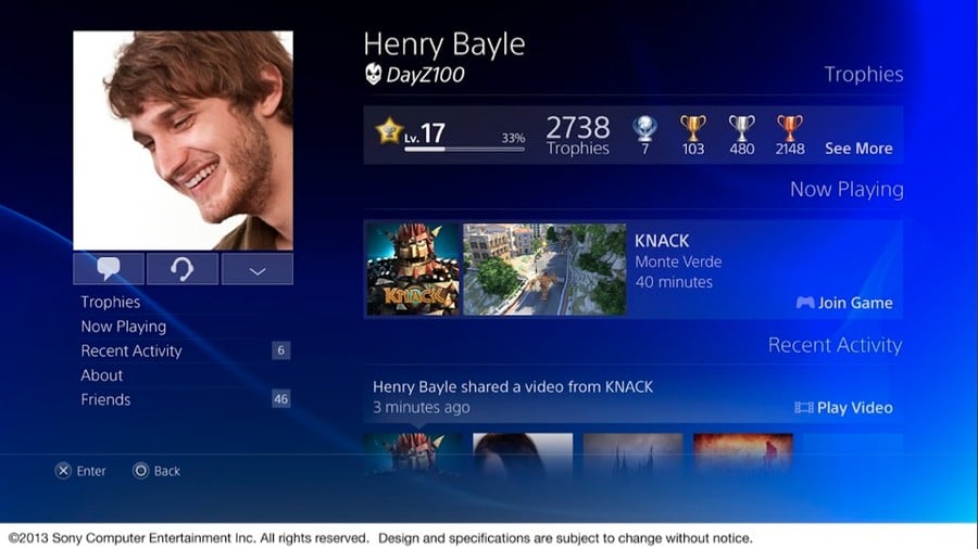
Dreary, uninformative Trophy cards are a thing of the past it seems. Sony has opted to evolve its user profiles system exponentially, incorporating a social network-esque approach. It seems that your real life information will now take priority over your online persona, with the option to add a personal photograph as your player icon now apparently possible. It’s likely that you’ll be able to snap these pictures with the new PlayStation Eye camera, which is rumoured to ship alongside the console. Furthermore, it seems that you’ll be encouraged to attach a full name to your profile, which will be displayed more prominently than your virtual alias. The platform holder is clearly hoping that diminished anonymity will prompt players to take more responsibility for their actions during heated online multiplayer sessions.
You’ll be able to instantly access communication channels such as messages and what appears to be cross-game chat from a menu on the left. Meanwhile, a ‘Now Playing’ section in the centre of the profile provides information about the title that you’re currently playing, in addition to a live video feed of what you’re up to and an option for other people to join. Trophies are placed prominently at the top, while a ‘Recent Activities’ feed appears to recap all of your gaming highlights in one easy to navigate timeline. It’s not hard to imagine this operating in a similar manner to the PlayStation Vita’s existing LiveArea.
Subscribe to Push Square on YouTube166k
Application Navigation
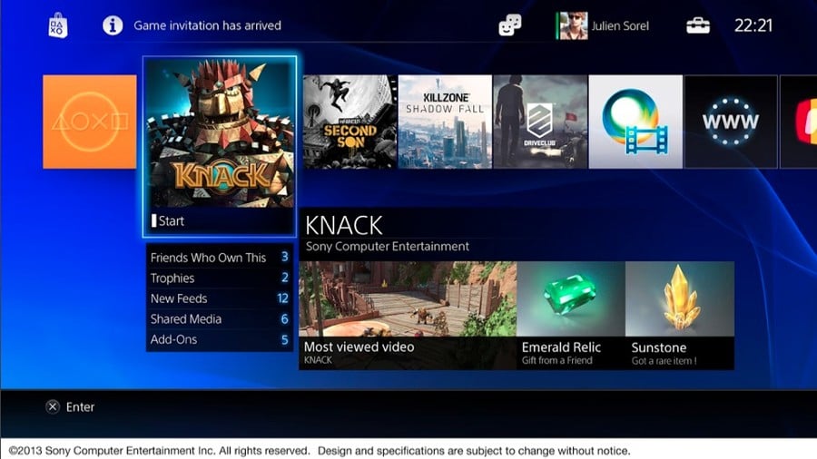
It’s unclear if this aspect of the user interface is the main home screen, or an applications screen similar to the Xbox 360’s games list. We’re going to assume – purely because of the very specific information displayed – that it’s actually the latter. A list of tiles across the top appear to show different titles, with each selectable for more information. You can instantly see which of your friends own a particular game, which Trophies you’ve unlocked, if any new activities have been uploaded to the release’s timeline, and whether there are any add-ons available.
A separate box provides a link to the current highest rated video – presumably on a global basis – in addition to gifts that you may have received from friends. This indicates that the PS4 will adopt the Vita’s existing ‘Game Goods’ system, allowing you to share rare content unlocks with other players. The inclusion of the PlayStation Store logo at the top of the screen indicates that you’ll be able to access the digital shopping plaza at any time, while Game Invitations and other alerts will be displayed prominently alongside it. Similarly to the store, your friends list, profile, and system settings will always be available courtesy of the three icons to the right, with the clock boasting a rather fetching font.
Share Button
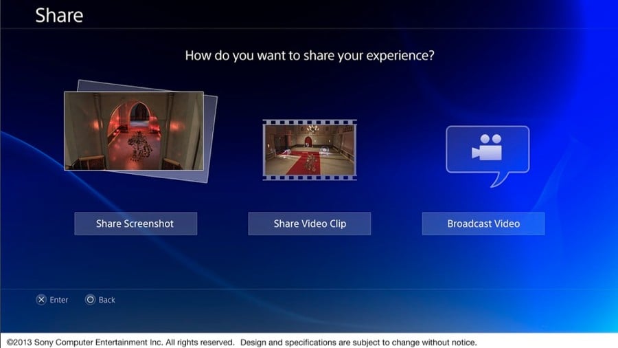
Pushing the DualShock 4’s new ‘Share’ button will bring up this screen. From the menu you’ll be able to instantly upload a screenshot, as well as a video clip. You’ll be able to trim these clips into more manageable chunks, as evidenced by a separate image available through here. Meanwhile, a third option will allow you to broadcast video to your friends.
Broadcast Area
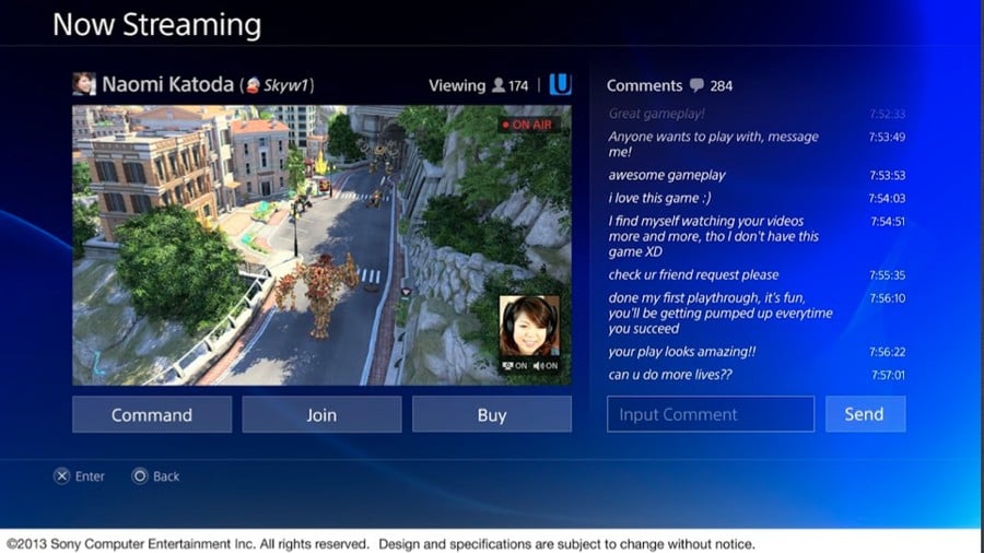
Arguably the most interesting addition to the PS4 will allow you to broadcast to other players live. A chatroom-esque environment will allow other people to comment on what you’re up to as you play, prompting real-time communication and moderation headaches. You’ll be able to see how many people are watching you at once, while your friends will be able to join your game at any given moment. It’s unclear what the ‘Command’ button means, but perhaps it’s there so that other players can give hints and encouragement as you progress. A further ‘Buy’ button will presumably take you to the PlayStation Store, where you’ll be able to instantly purchase the title on display. It’s probably worth reiterating that all PS4 games will be available digitally, and you won’t even have to wait for the full package to download before you start playing.
Perhaps most interestingly, it seems that you’ll be able to attach a webcam feed to your stream while playing. This will likely become a particularly popular feature for people who want to have a direct communication with viewers. Thankfully, it seems like this isn’t required, with ‘On’ toggles suggesting that you can turn off both the camera and microphone options if you want to.
Activities List
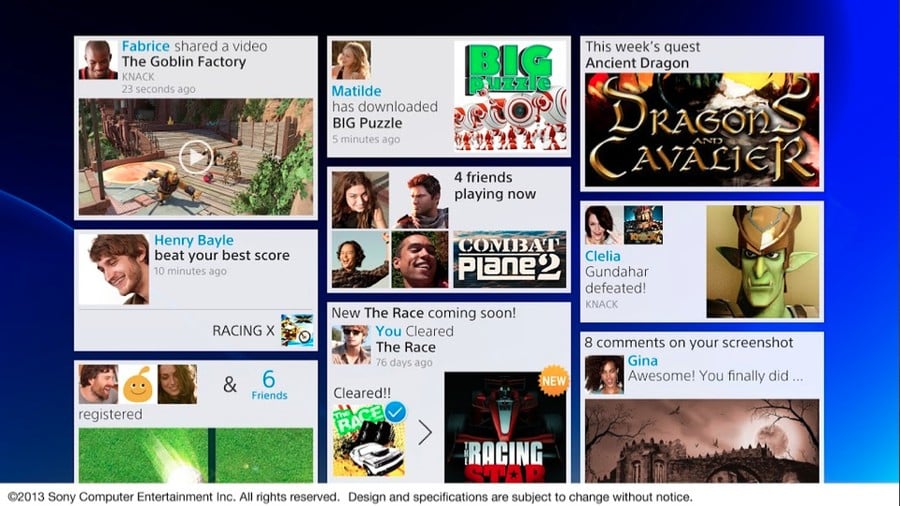
Perhaps the most cluttered of the interface screens released, this activities area appears to show everything that’s been happening amongst your friends. It seems that this won’t be limited to just new video uploads, but will also expand to score challenges and more. With the popularity of mechanics like Autolog in Need for Speed, this could come in particularly handy. Another area appears to indicate that developers will be able to push notifications out to you, with one box revealing a new quest is available in a fantasy game. It’s not hard to imagine official PlayStation Blog content being fed into this area of the system, with filters perhaps tailoring specific content to your tastes.
Just like with the Vita, you’ll be able to comment on activities, as evidenced by one of the screenshots which includes eight comments. It looks like this area will also highlight current activity hotspots, like the fact that there are multiple people on your friends list playing a specific game. Considering the cohesiveness of the rest of the interface, we imagine that you’ll be able to join your buddies with the click of a button.
Tablets and Smartphones
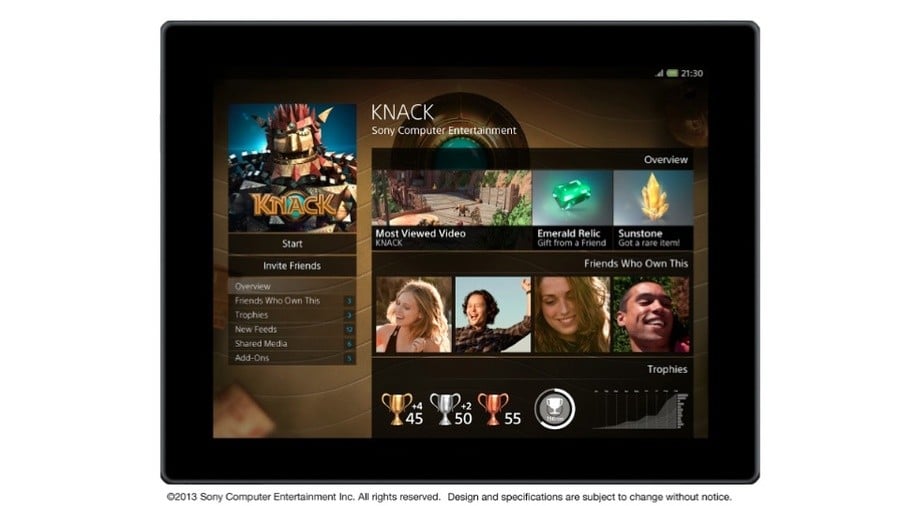
While the tablet interface doesn’t appear particularly different to the main console screen, we thought it was interesting that it includes more detailed Trophy information. There appears to be a graph demonstrating your progress over a prolonged period of time, which insinuates that the PS4 may provide more statistics pertaining to digital trinkets than the manufacturer’s current consoles. As big fans of the tools on PSNProfiles.com, we’re particularly excited to see how Trophies are evolved on PS4.
Truth or Lies
The big question is: are these images true representations of the final product? It’s true that they could be mere target renders designed in Photoshop, but we don’t believe that that’s the case. While details are always subject to change, we actually caught a glimpse of Killzone: Shadow Fall’s use of the ‘Share’ button during last week’s PlayStation Meeting. At the end of Guerrilla Games’ segment, the company uploaded a video clip to Facebook, using an interface exactly the same as the one pictured above. Furthermore, when the Vita was announced in 2011, Sony released similar screenshots of its UI, and it barely changed between announcement and launch. If the PS4 is set to ship later this year, then we have to imagine that the interface is almost final at this point.
What do you think of the PS4’s interface? Does it include all of the features that you wanted it to? Is there something missing that you hope is added in before launch? Let us know courtesy of the comments section and poll below.
What do you think of the PS4's user interface? (27 votes)
- I think it looks super, super cool
- I like the features, but I'm not keen on the look
- Meh, I think it's a mess
Please login to vote in this poll.


Comments 18
I love most of these features but my internet sucks so must of them will be useless for me and anyone in this country.
I agree, it is tantalizing to think of the possibilities the PS4 will offer but without fibre optic broadband will we see the full potential of the machine. I want one on day one but may have to assess my internet situation first.
With the personalized player icons I wonder, how many Miis are going to float around the PlayStation Network? Mine will
To be honest I don't care about any of those features I just want to play games. I like comparing trophies and seeing what other people are playing but that's about it.
I don't hate the features by any means, I'm just not excited by them.
I get the feeling this isn't the main UI, just portions of it after you select something. For example, on PS3 you get the XMB, then select the Store app and it looks similar to this.
The main UI you get when you power on the machine may look completely different to this.
If this is how the new interface looks, I'll be extremely pleased. I'm glad Sony is deciding to play hardball this time around, it's good for them and their competition.
They need to make certain to add privacy options such as "only friends can view my full name"
I won't be making much use of the video feeds or webcasting or anything, but it's a cool feature. And good catch on that trophy graph. I love playing statistics. I love Nintendo's statistics like how many hours you've played a game. Hopefully we get some of that kind of stuff on PS4. And give us a dang wishlist on the store.
Sony's social is pretty good, so this share feature might be pretty cool.
The PS3 user interface needs a major overall and way more features/control options. All the stuff above sounds great and looks good but they are on the tip of the iceberg of what is needed. I hope there is loads more stuff to come.
e.g. Just 1 example. As a parent I want true user control with a password on my account. I want to be able to age lock functionality for each of my kids separately etc. At the moment my 9 year old hasn't worked out that if she connects as me she can download pretty much anything she wants. Plus play all my mature games/demos etc. She is tech savvy and it is just a matter of time.
Interesting. Kinda Sony's way to take all the wind out of Youtube and Facebooks sails. At least the gaming wind. How many playthroughs and walkthroughs will be posted?
@Ginkgo Yea, I think privacy and control settings really need an improvement if consoles are adopting a facebook and youtube type setup. No parent in their right mind would be comfortable giving their kids free reign over such a thing.
I'd also be nice for those who simply just want a console, without more facebook/twitter type stuff to deal with. Thats the good thing about consoles becoming more PC like, it opens up more options for this sort of thing.
It's very nicely designed and - if they use Facebook as the foundation for the social features and profiles - then it could be a truly great service.
I'm not a huge fan of slapping a massive picture of my face on my profile - nor am I a fan of using my real name on the PSN. It does seem like Sony are grabbing for the same feel of something like Facebook - but I think it's a completely different user environment and it kind of worries me that a lot of 'hardcore' gamers won't be pleased with this approach to social networking.
That said, I doubt we'll be forced to share all of this information anyway, and I do like the look of it. The XMB has been pretty solid over the years but there's no denying it's really starting to show its age. Can't wait to see more of the PS4's UI.
@ShogunRok I definitely don't think you'll be forced to share your personal information if you don't want to. I imagine there'll be filters on that stuff, too. For example, perhaps only your friends will be able to see your personal information, while everyone else will get your alias.
@Epic i know how you feel, i have barley any internet at all. i like some of these screens but i think they are a bit to cluttered and looks similair to the 360. so i kinda hope they change a bit of it so it looks a bit more unique.
Something should be different for the final launch version. I could see the navigation being very similar though. I'm seriously hoping they have a more clean, intuitive navigation that is unique, and not just a bunch of tiles.
I have a feeling there is some restriction for User Profile, since we all know there is ppl, who would use Sexual Content as Profile Picture.
I would like to see, how changing user on System look like and if they use PS3 model (DLC/Theme can be used on any account on the consol, as long as you have the account on the system)
Show Comments
Leave A Comment
Hold on there, you need to login to post a comment...