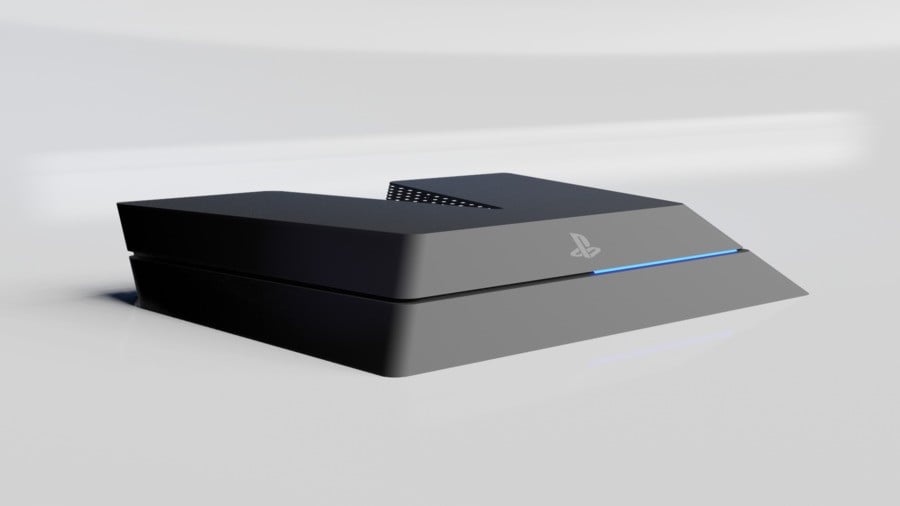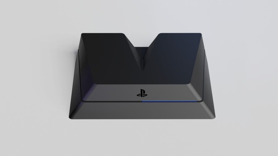
A new fanmade PlayStation 5 render is doing the rounds on social media right now, and we think it looks pretty slick. The design adopts the sleek black plastic of the PS4, which, when combined with the blue power light, gives it a familiar feel. Obviously, though, the design's defining trait is its 'V' shape, which is no doubt a reference to the leaked PS5 devkit.


Again, this isn't official -- despite what you may have heard across Twitter and Facebook -- but we like it a lot. That said, we're not sure how you'd stand this thing vertically -- it'd need some kind of specially built platform.
Sadly, we don't know where this render comes from. We traced it back to Imgur, but if you have the original source, feel free to get in touch.
In the meantime, let us know if you'd be happy with this PS5 design in the comments section below.
[source imgur.com]


Comments 31
Definitely looks more classy than the dev kit version.
I think this is probably a best case scenario if the V shape sticks around for the final product. Cool creation anyway
I would love it if Sony went back to the PS One grey for PS5.
Looks a bit too much like the PS4 for my liking. Kinda hoping for a newer design than just the wedge thing again.
Been talking to work mates since last summer about the shape of the new consoles,I said at the time that I thought they would go with a tower ,I was right about Xbox and I still think ps5 will be tower shaped
I don't like it, it's kind of weird, just like original ps4 but there's v-shaped hole in the back. I like the devkit better, it looks like futuristic console with serious cooling system in the middle.
I always thought the next logical step after the parallelogram was the trapazoid.
This is good. The V (Roman '5') definitely makes sense from a design standpoint.
This makes me want to eat a slice of birthday cake
Honestly, I think that looks awful. I'd rather have the dev kit version lol.
Sooner Sony shows off the real thing the better. Maybe im boring, but i dont really care for the leaks of the dev kit, or the mock ups on the internet. Want to wait for the real thing in a couple of months (i'm getting old 😅)
I don't think PS will go down the tower route, Sony want people to adopt this in the sitting room. This is most likely a large majority of users. Having something that doesn't fit in the suburbia media cabinet won't go down well with buyers. I suspect that restricts a lot of design and cooling for a console. Xbox have stated they are breaking the boundaries on the design with the Series X, essentially a PC tower, definitely for a gaming/bedroom than the sitting room.
looks better than dev kit, but i need it to be able to stand vertically
it sure looks better than the dev kit, but then again, most consoles hardly resemble the dev kit. It looks "okay", I think? but after the jaw-dropping design of PS4 I expect perfection from Playstation.
Besides, the real one would hardly look anything like this, consoles are mostly both horizontal and vertical. The Xbox SX is, I would like to have the option.
The only way it looks good is if my eyes are closed
still think this fan-made one looks much better: https://www.youtube.com/watch?v=z_HuAa5fTqY
It was confirmed a long time ago that the only reason that the devkit has a V-shape is so that it has sufficient airflow while multiple devkits are being stacked on top of eachother.
You'll even see the rubbers on top of the devkit that are there for stacking purposes.
The consumer version will not have this V-shape.
Am I the only that doesn't care at all about the design?
I give it an A for awful. Haha.
I like simple black case that does not distract me from the TV screen. If you really want something flashy. PS4 on a ATX motherboard in a windowed case would be best. Allowing custom led coolers and much more. I build quite a few custom PC's and hundreds of dollars for a single custom build. Simple saves you a lot of money!
For that reason I also like the looks of this PS4 over the Dev kits.
@stuzster Well at least the message will be a step towards the end of console wars if a console manufacturers next console looks like a peace sign standing up.
@stuzster ??? ✌️✌️. Am I missing something?? That's what I thought of from your reply.
Think I'm the only one on the entire internet that really liked the V dev kit looks. Not that I buy a console on looks, this thing could look like the Selfridges building and I'd end up buying it.
Edit: Having said that...:
https://imgur.com/TY7lwbn
@BarefootBowser None of the consoles from the Playstation family look like a toy. I don't think they would change now.
Looks like crap.
@AdamNovice I dont know if that colour would be passable for 2020... there will be many special editions but
Looks hideous.
looks pretty awful if i’m being honest. playstation designs always had very clean and simple shape-designs. PS1 was a square. Ps2 was a rectangle. ps3 built upon the design of the ps2 while having its own unique yet still simple edge. and ps4 is a square. there’s no reason not to believe that the ps5 should be anything other than a square or a rectangle. that has been the status quo since the beginning and changing it now would be foolish.
Looks like a cross section of a Toblerone bar.
@Tasuki In the UK two fingers up (hand turned the opposite way around to the peace sign) is a way of telling people to go away and procreate. Or to F-off if you want it in simpler terms.
Nah. Disliking! Yucky! Good thing that it is fanmade.
Leave A Comment
Hold on there, you need to login to post a comment...